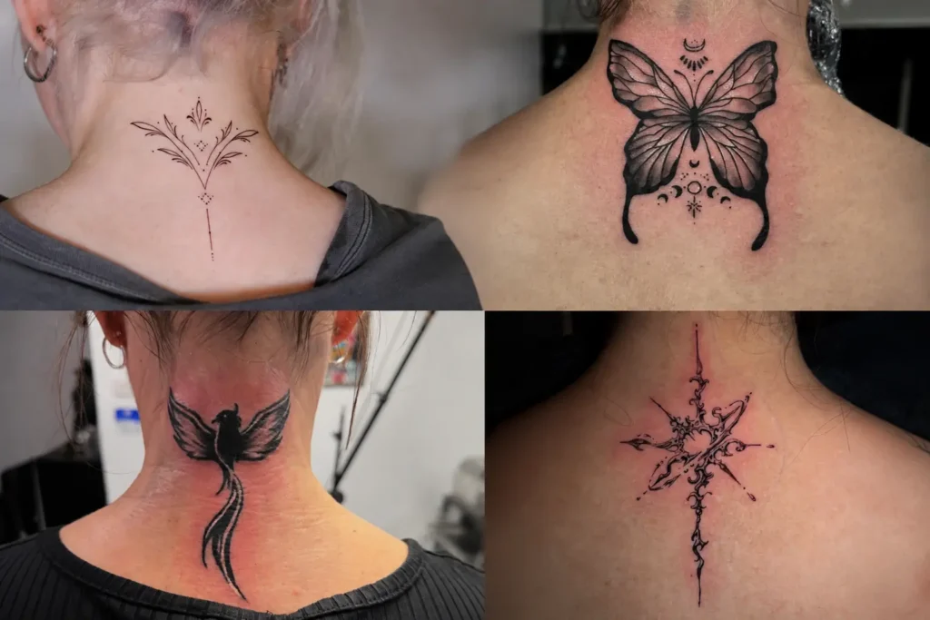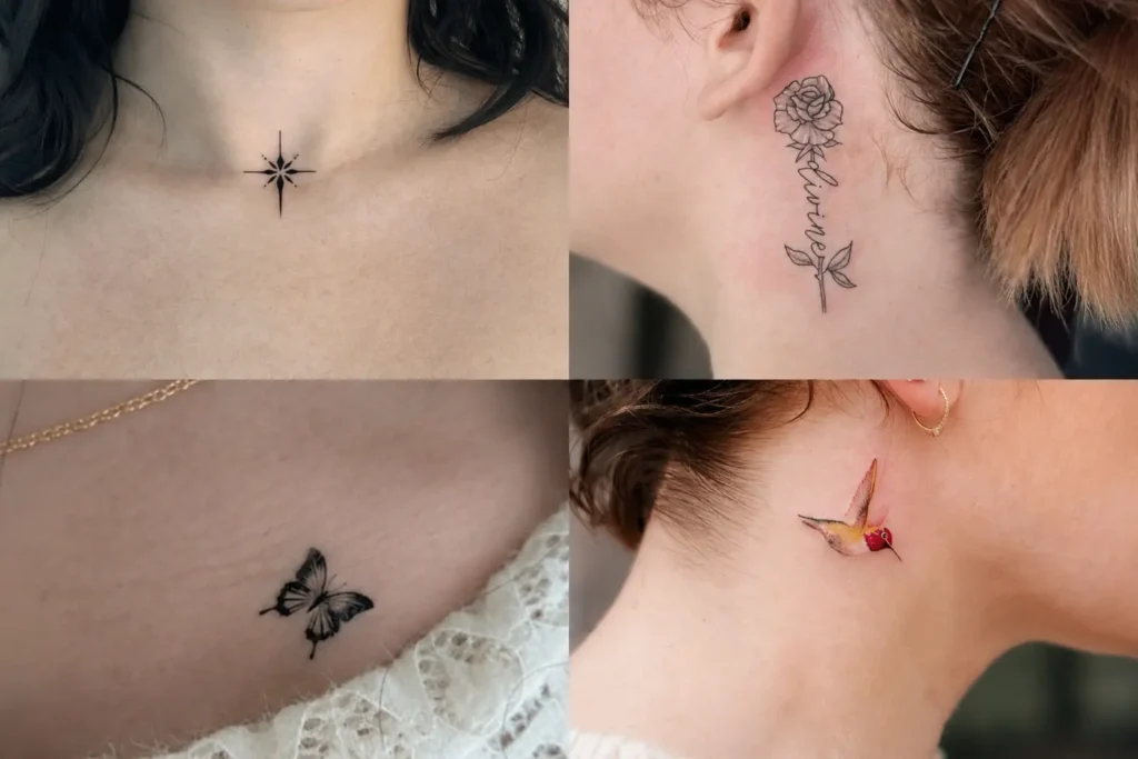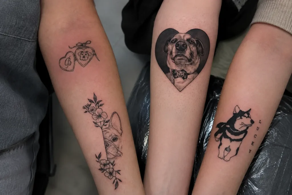
Few body placements have quite the same natural direction as the collarbone, where a tattoo can trace a gentle curve instead of sitting on a flat visual plane. Proportion matters here because the available space is narrow, yet its shape can accommodate artwork that stretches, bends, or settles neatly beside the bone. A collarbone tattoo can feel understated through restrained linework or gain presence through stronger contours and concentrated detail. Placement also changes how the eye reads the artwork, making spacing, orientation, and surrounding skin important parts of the finished composition rather than afterthoughts.
1. Celestial Drift
Celestial Drift creates a loose horizontal composition that suggests movement across the collarbone without forcing the elements into a rigid row. Fine linework can keep the separate celestial forms visually light, while uneven spacing prevents the arrangement from feeling mechanically repeated. Leaving clear gaps between individual marks gives the skin an active role in the composition. A slightly wandering baseline can also make the artwork follow the natural curve beneath the collarbone rather than cutting across it like a straight band.
2. Serpent Line
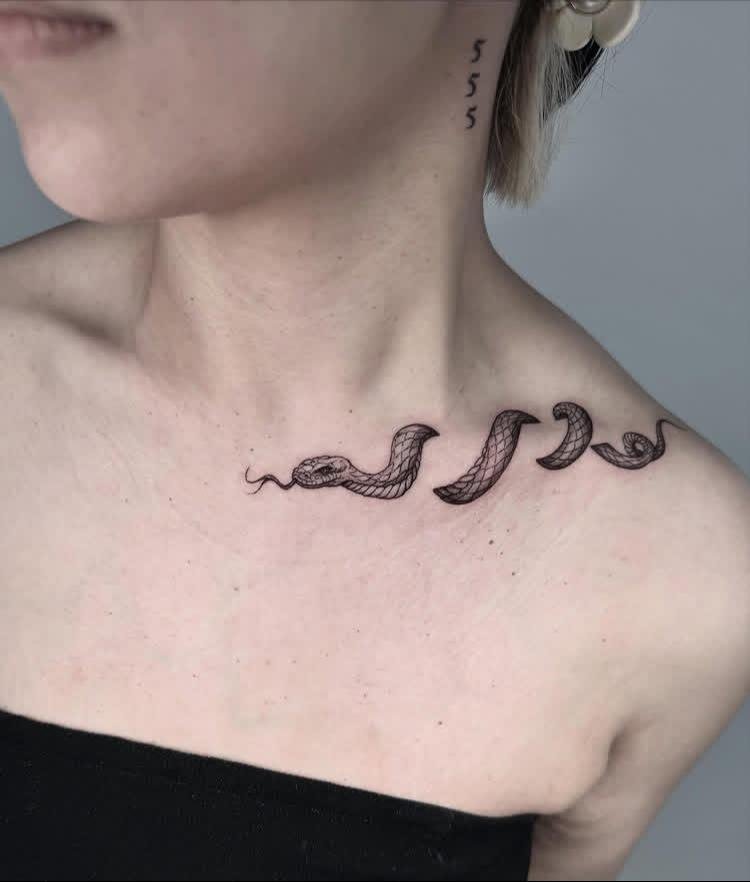
Serpent Line relies on the snake’s continuous body as its main compositional feature. Rather than breaking the form into separate sections, flowing linework can trace a controlled path that follows the available space along the collarbone. Curves in the body create changing visual direction, while selective line-weight shifts can give certain bends more emphasis. Keeping the interior relatively restrained allows the silhouette to remain readable, especially where the body narrows or overlaps itself.
3. Quiet Vine
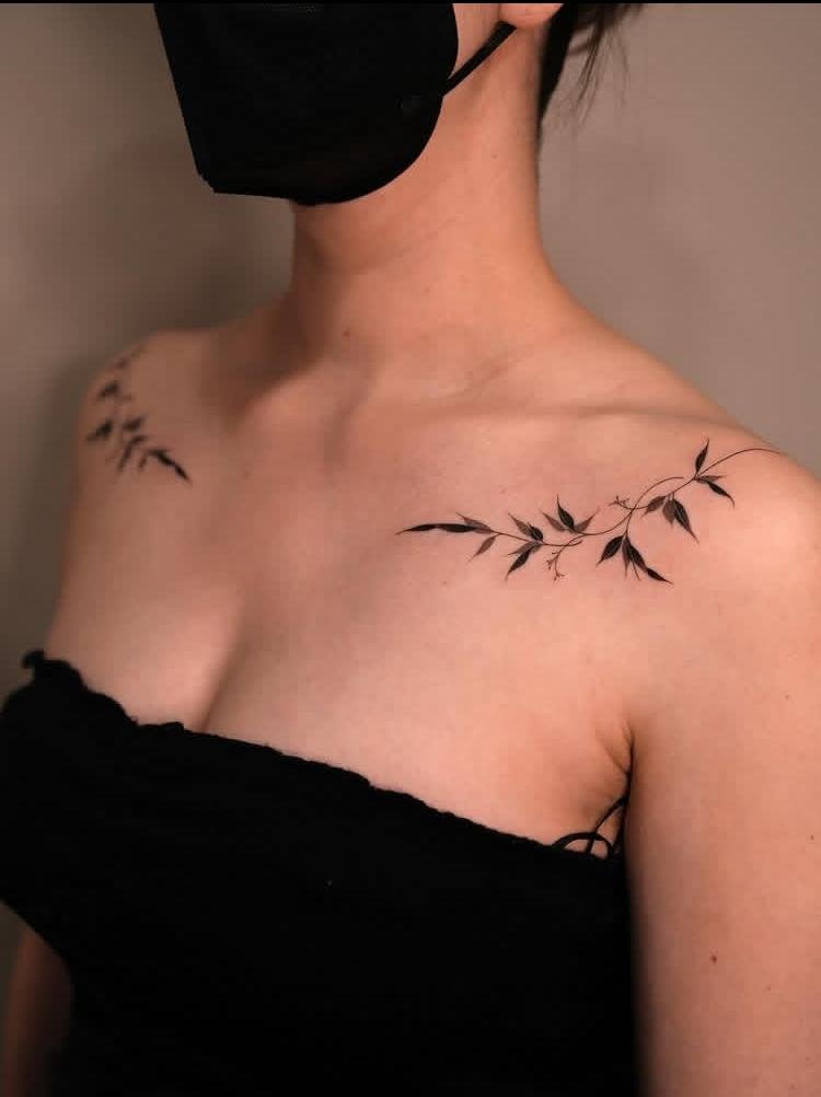
Quiet Vine works through a restrained, elongated arrangement that lets the vine travel naturally across the skin. A thin stem can establish the main direction, while smaller leaf forms interrupt the line at varied intervals rather than appearing evenly mirrored. Negative space between leaves keeps the composition open and prevents the narrow placement from becoming dense. Gentle bends in the stem are particularly useful here because they can echo the collarbone’s shape without making the artwork appear artificially fitted to it.
4. Lavender Fall
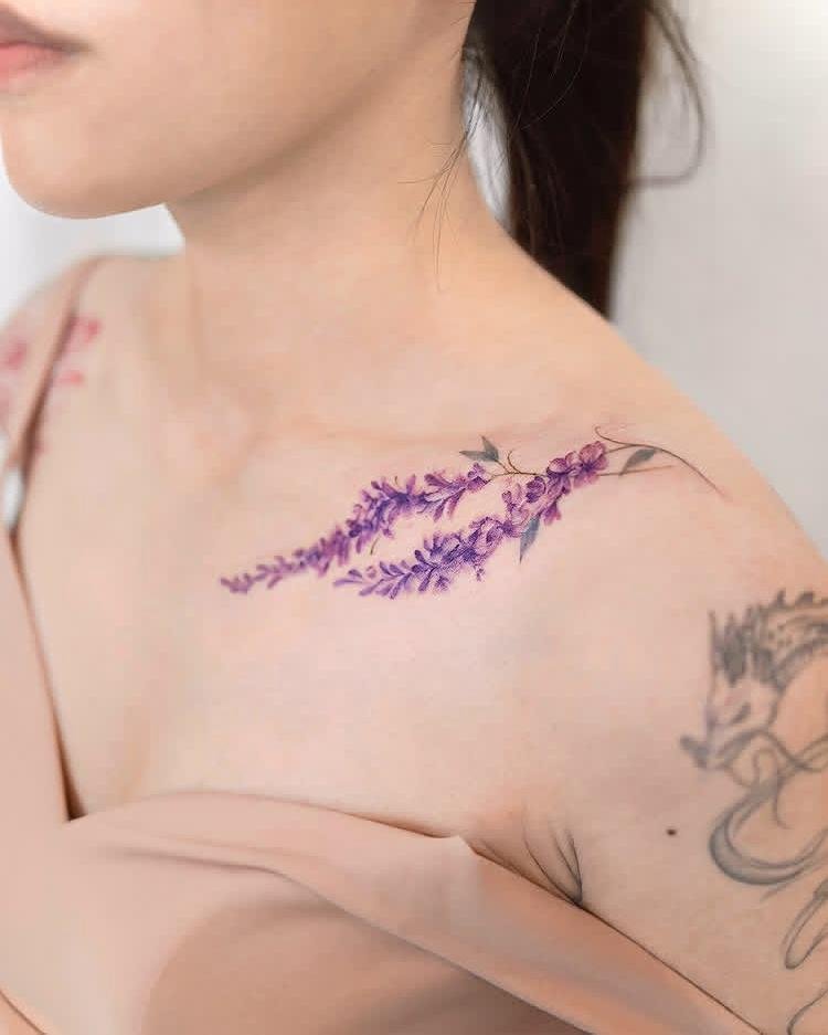
Lavender Fall centers on the recognizable vertical structure of lavender stems and their clustered flower heads. Multiple stems can be arranged so they descend or angle slightly from a shared direction, creating a soft sense of falling movement. Fine outlines help preserve the narrow shapes within each sprig, while modest shading can separate overlapping stems without filling the surrounding skin. Since lavender is specifically named in the concept, the tattoo can use lavender-toned ink selectively through the flower clusters while keeping the stems visually defined.
5. Butterfly Trail
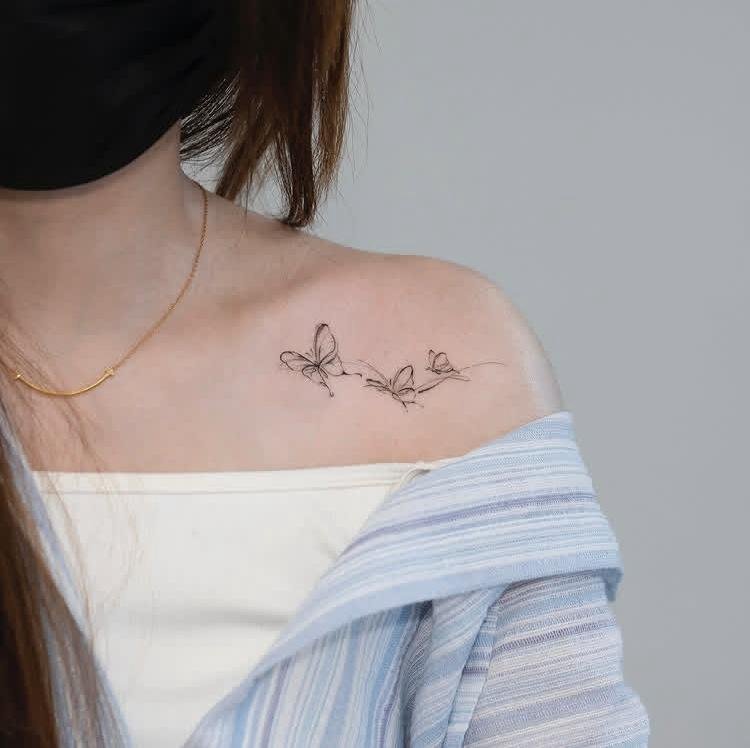
Butterfly Trail turns several butterflies into a directional composition rather than treating them as isolated motifs. Wing sizes can shift gradually along the path, giving the trail a sense of distance and movement. Uneven spacing keeps the arrangement organic, while different wing orientations prevent every butterfly from appearing stamped from the same template. Open skin between the insects is important because it separates their silhouettes and allows the eye to follow the trail naturally across the collarbone area.
6. Ember Bloom
Ember Bloom combines the visual structure of a bloom with the irregular energy suggested by an ember. Petal forms can radiate from a compact center, while the outer edges become less uniform to create a sense of movement. Controlled linework can define the flower without crowding its center, and small breaks in the surrounding form preserve breathing room. Because “ember” suggests a glowing quality, restrained shading can create depth around the bloom while avoiding unnecessary secondary motifs.
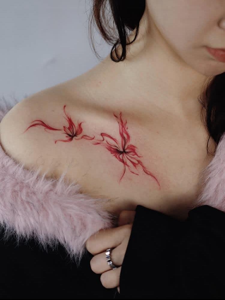
7. Little Flock
Little Flock uses a group of small birds as the entire visual subject, making spacing central to the composition. Instead of arranging every bird at the same height, varied positions can create the impression of a flock moving together through open space. Individual silhouettes should remain simple enough to read at a small scale. Wider gaps around the outer birds help the group retain an airy boundary, while the central cluster can carry slightly more visual weight.
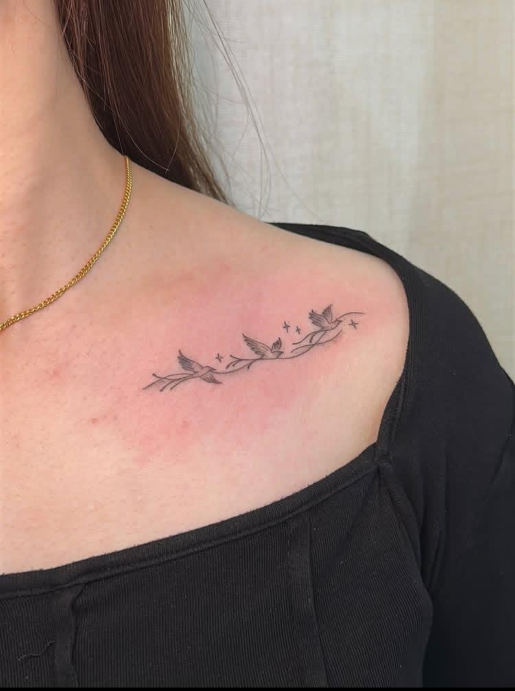
8. Wishes Adrift
Wishes Adrift is built around the idea of small wish-like forms drifting apart through open space. The composition benefits from irregular positioning rather than a symmetrical arrangement, allowing the eye to travel from one element to the next. Fine linework can keep the individual marks crisp without making them visually heavy. Preserving generous skin between the forms is especially important because the concept depends on separation and movement rather than a tightly connected cluster.
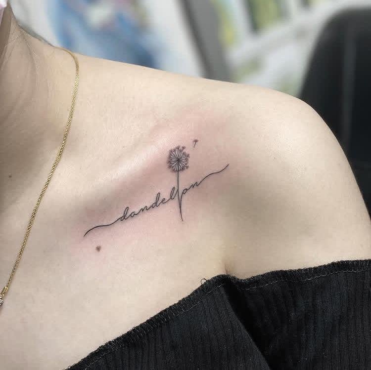
9. Dragon’s Reach
Dragon’s Reach gives the dragon a directional role, with its body extending toward a clear endpoint rather than sitting as a compact emblem. Curved anatomy can create a long visual sweep suitable for the collarbone’s horizontal structure. Linework around the head can carry more detail, establishing a focal point before the eye follows the body outward. Keeping the narrower sections less crowded allows the silhouette to remain readable and prevents the extended form from becoming a mass of overlapping lines.
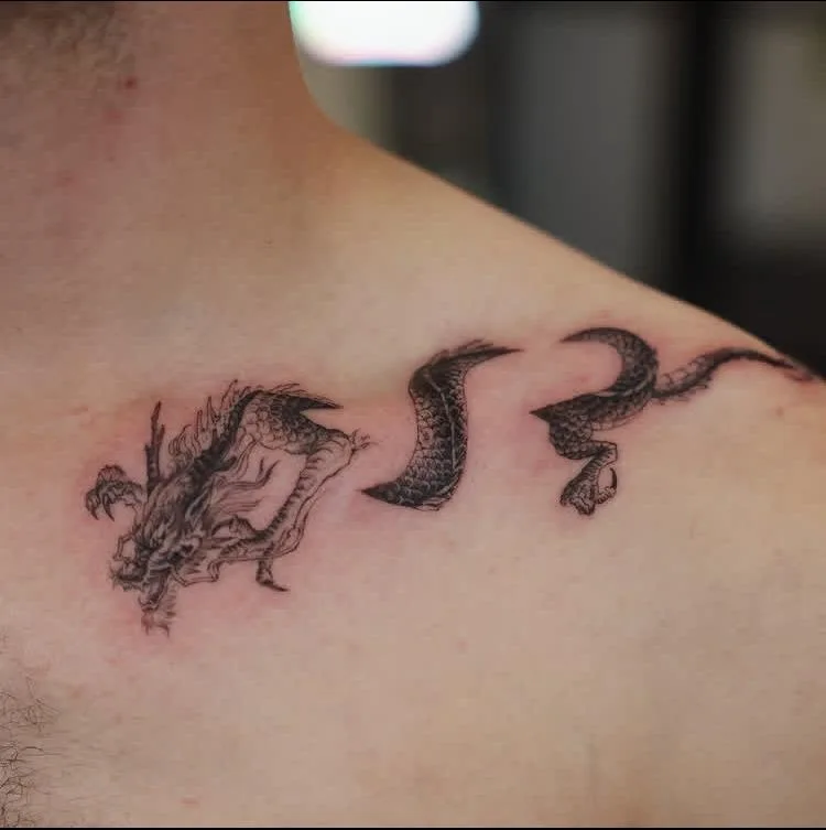
10. Spring Migration
Spring Migration uses multiple migrating forms to create a sense of travel across the skin. Their positions can gradually shift in height and direction, producing a loose route rather than a straight procession. Consistent proportions help the group feel connected even when the individual figures are separated. Negative space becomes part of the composition, giving the eye room to move between subjects and keeping the migration pattern from turning into a dense horizontal strip.
11. Blossom Drift
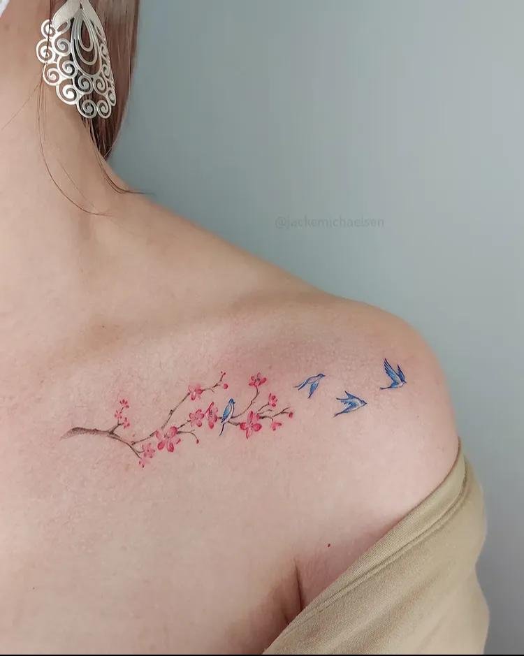
Blossom Drift focuses on flower forms moving loosely through space rather than forming a conventional bouquet. Different blossom orientations can break up the composition, while varied distances between them create a gentle directional path. Linework should distinguish the individual petals clearly without filling every available area. Keeping the flowers separated allows the concept of drifting to remain visible; a tightly packed floral cluster would change the visual character of the idea entirely.
12. Twin Branches
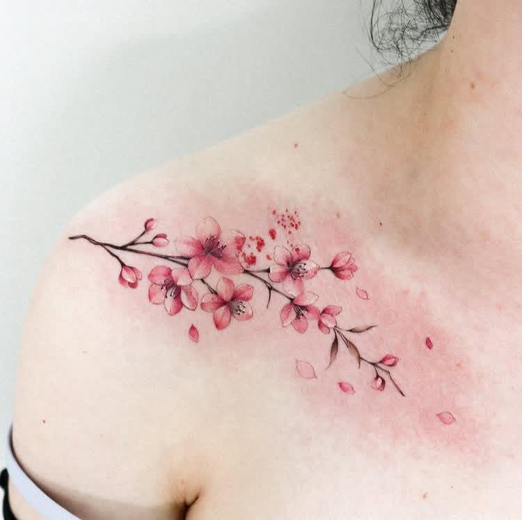
Twin Branches depends on two related botanical forms rather than one continuous arrangement. Matching branch structures can establish visual balance, while slight differences in their angles keep the composition from becoming perfectly rigid. The branches may face inward or follow neighboring paths, creating a controlled relationship across the available area. Fine interior lines can suggest the structure of the branches without adding unrelated foliage or turning the paired forms into a larger botanical scene.
13. Sheer Wing
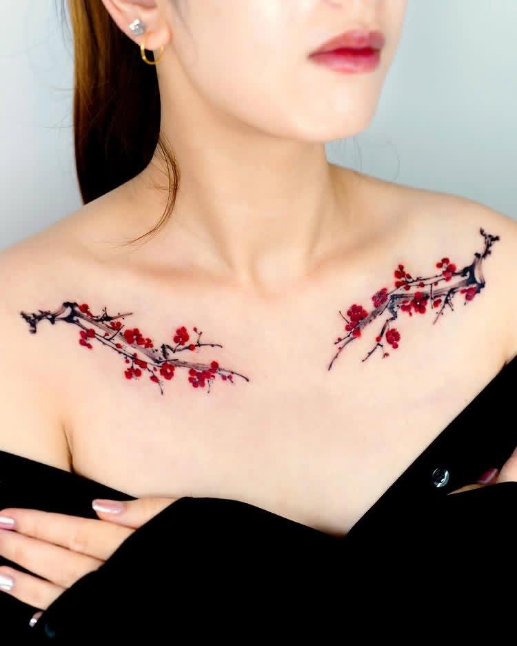
Sheer Wing places attention on one wing and its delicate internal structure. Fine outlines can define the outer contour, while narrow gaps between the internal sections create a translucent impression through negative space. Rather than relying on heavy filling, the tattoo can gain depth from layered linework and selective shading. Keeping one edge slightly more defined than the other can also create a directional quality without introducing another object into the composition.
14. Little Sea Dragon
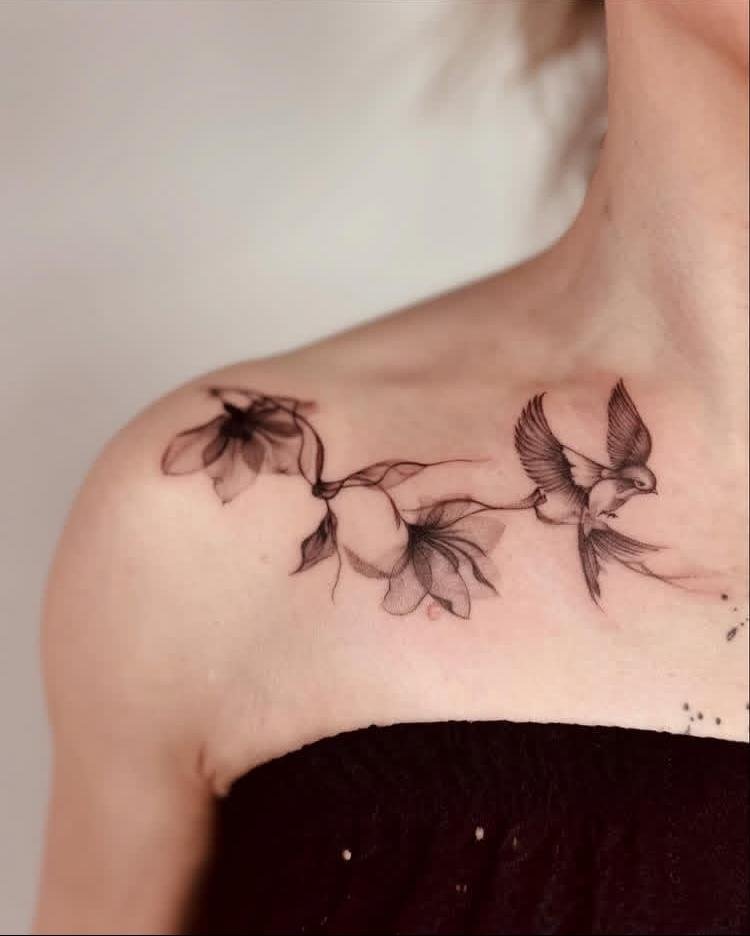
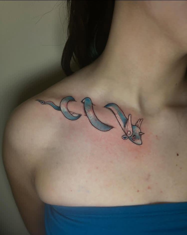
Little Sea Dragon keeps the subject compact, allowing the creature’s silhouette to carry most of the visual information. Curving anatomy can give the small form a sense of movement, while carefully placed internal lines distinguish its characteristic features. Scale matters here: excessive micro-detail could blur as the tattoo ages, so the strongest features should receive priority. Open skin around the creature gives the small subject enough separation to remain recognizable.
15. Fading Rose
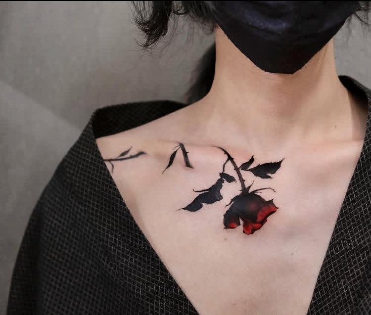
Fading Rose uses gradual loss of definition as the key visual feature. A rose can begin with clearer petal outlines near its center before becoming lighter and less complete toward the outer edges. Sparse shading can reinforce that transition without introducing another motif. Leaving sections of the outer contour unfinished gives the fading effect a physical quality, while the more concentrated central linework keeps the flower identifiable rather than allowing it to dissolve completely.
16. Dagger Pair
Dagger Pair is organized around two blades that share visual importance. Parallel placement can create strong symmetry, while opposing angles introduce tension and keep the arrangement from reading as a simple duplicate. Line weight around the blade edges can stay crisp, with darker areas reserved for the structural portions that need separation. Matching proportions between the daggers helps the pair feel intentional even when their orientations differ.

17. Gothic Garland
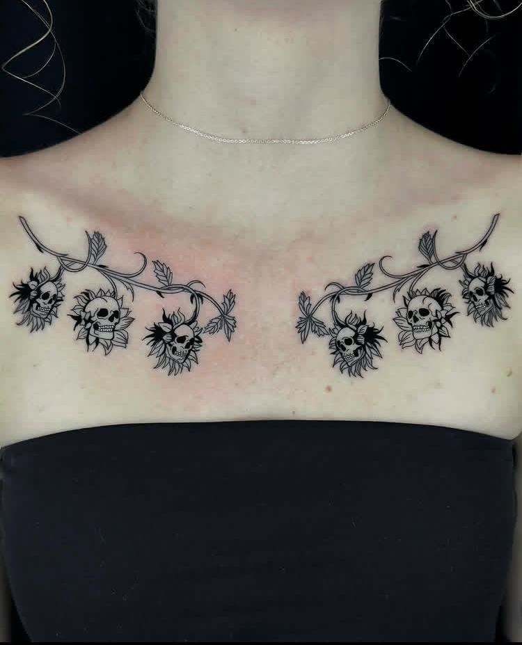
Gothic Garland creates an ornamental band through a continuous arrangement of gothic-inspired forms. Repeating pointed structures can establish rhythm, but small changes in spacing keep the composition from becoming overly mechanical. Stronger outlines around the primary shapes can anchor the garland, while finer interior marks add texture without filling every opening. Since the concept is specifically a garland, continuity matters: separated motifs should still read as parts of one connected decorative arrangement.
18. Hummingbird Duo
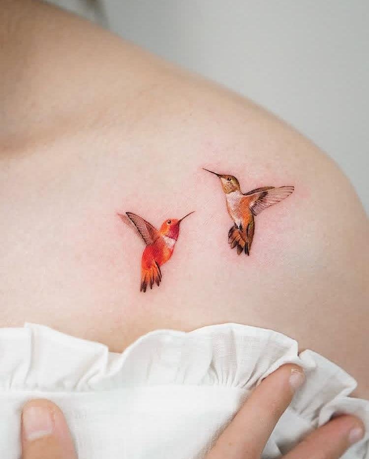
Hummingbird Duo gains interest from the interaction between two small birds rather than from a single focal subject. Their bodies can face related directions, creating a visual conversation through orientation and spacing. Wing positions may differ so the pair does not appear duplicated, while consistent line quality keeps them visually connected. Maintaining open space around the birds is useful at this scale because their narrow bodies and wing shapes need enough separation to remain distinct.
19. Autumn Wreath
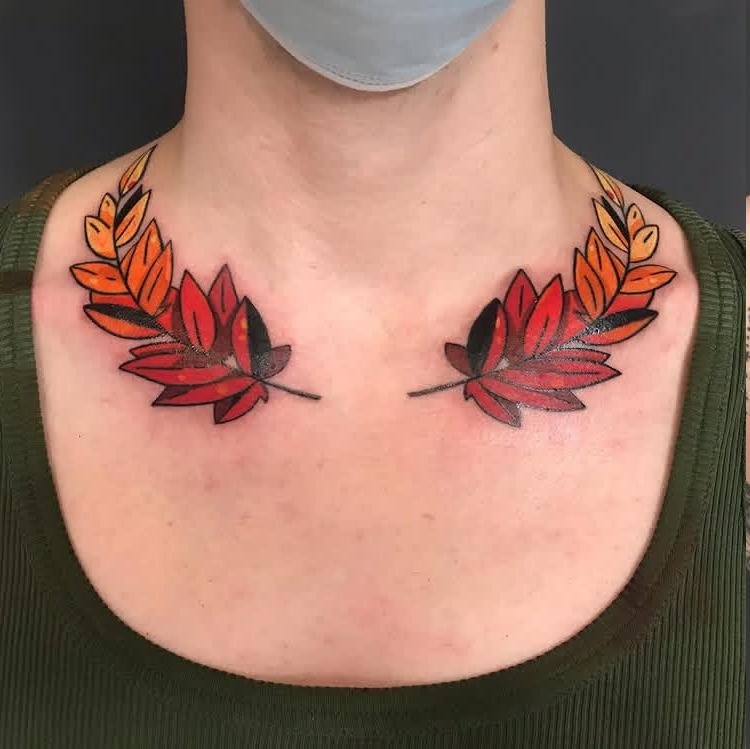
Autumn Wreath forms a circular or gently oval arrangement based specifically on seasonal foliage. The wreath can remain open rather than becoming a fully packed ring, allowing sections of skin to break up the perimeter. Varied leaf shapes give the circumference natural rhythm, while slightly stronger outlines around selected areas create depth. Since the autumn theme is central to the heading, autumnal colors can be incorporated into the foliage without adding unrelated objects or decorative symbols.
20. Scattered Sparkle
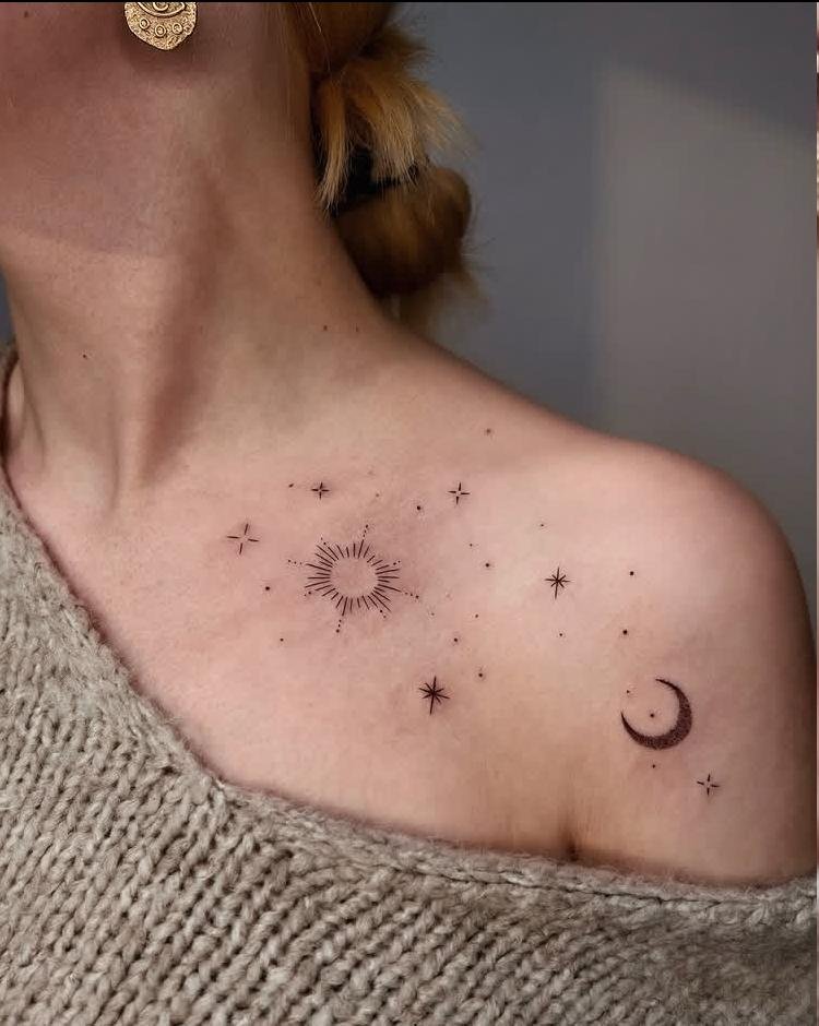
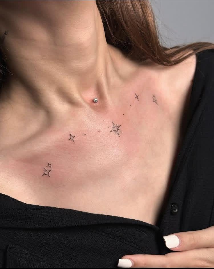
Scattered Sparkle relies on small sparkling marks distributed across an open composition. Instead of placing them at equal distances, varied sizes and spacing can create a more natural scatter. Crisp linework keeps the tiny shapes recognizable, while generous negative space prevents the collection from becoming visually noisy. A few larger sparkles can act as focal points, with smaller marks gradually thinning toward the edges to give the arrangement a sense of dispersion.
21. Cosmic Symmetry
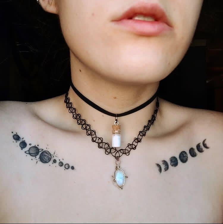
Cosmic Symmetry uses balanced celestial forms arranged around a central visual axis. Mirrored placement can give the tattoo a structured appearance, while small differences in line detail prevent it from feeling mechanically copied. Negative space should remain comparable on both sides so the symmetry reads clearly. Concentrating detail near the center and simplifying the outer forms can also create a controlled progression from focal point to surrounding space.
22. Candy Constellation
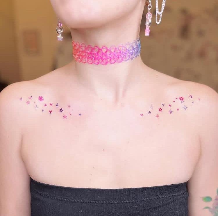
Candy Constellation combines constellation-like structure with a candy-inspired visual treatment. Small connected points can establish the constellation framework, while candy shapes or accents provide the defining secondary character. Because the concept contains two distinct ideas, spacing is important: separating the candy forms from the connecting lines keeps the composition readable. Candy-inspired colors may be used selectively, while the constellation structure can remain crisp enough to preserve its recognizable pattern.
23. Storm Bats
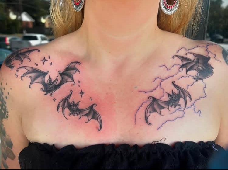
Storm Bats brings multiple bat silhouettes together in a composition that can feel restless and directional. Different wing positions give the group varied movement, while changes in height keep the forms from creating a repetitive row. Strong outer silhouettes are more useful than excessive interior detail because bats need to remain recognizable at a glance. Dense clustering can suggest a gathering, whereas wider spacing produces a more scattered flight pattern; either approach should retain clear separation between individual forms.
24. Trinket Trail
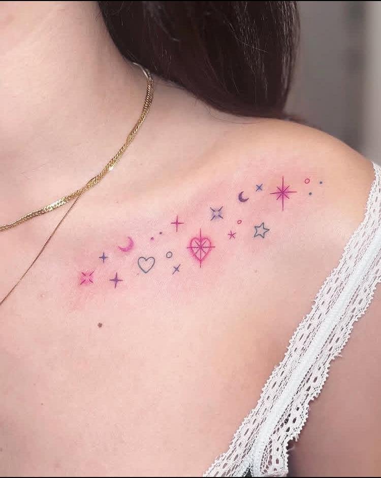
Trinket Trail arranges small trinket-like objects along a loose visual route, turning separate pieces into one connected composition. Uneven spacing can create a sense of movement, while alternating orientations keep the trail from appearing rigid. Each object needs enough open skin around it to remain identifiable, especially when the pieces are small. Keeping the overall path gently curved can also make the arrangement feel continuous without requiring every trinket to touch its neighbor.
25. Laurel Frame
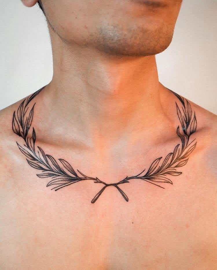
Laurel Frame uses paired laurel branches to create a defined border-like shape. Curving stems can establish the outer structure, while repeated leaves build rhythm along both sides. Symmetry works particularly well here because matching branches naturally guide the eye toward the open center. Leaf size can gradually change along the curves, giving the frame a tapered appearance rather than leaving every section equally dense. The open interior remains important because it completes the framed effect without adding another central motif.
Conclusion
Good collarbone ink often comes down to proportion, clarity, and how naturally the artwork follows the body. Narrow compositions can gain presence through clean contours, while more detailed pieces need enough breathing room to keep their shapes distinct. Scale also deserves attention because tiny features may lose definition over time if the artwork becomes too crowded. Before committing to a final collarbone tattoo, consider the direction of the main shape, the balance of empty skin around it, and whether its strongest details remain easy to recognize at the intended size.