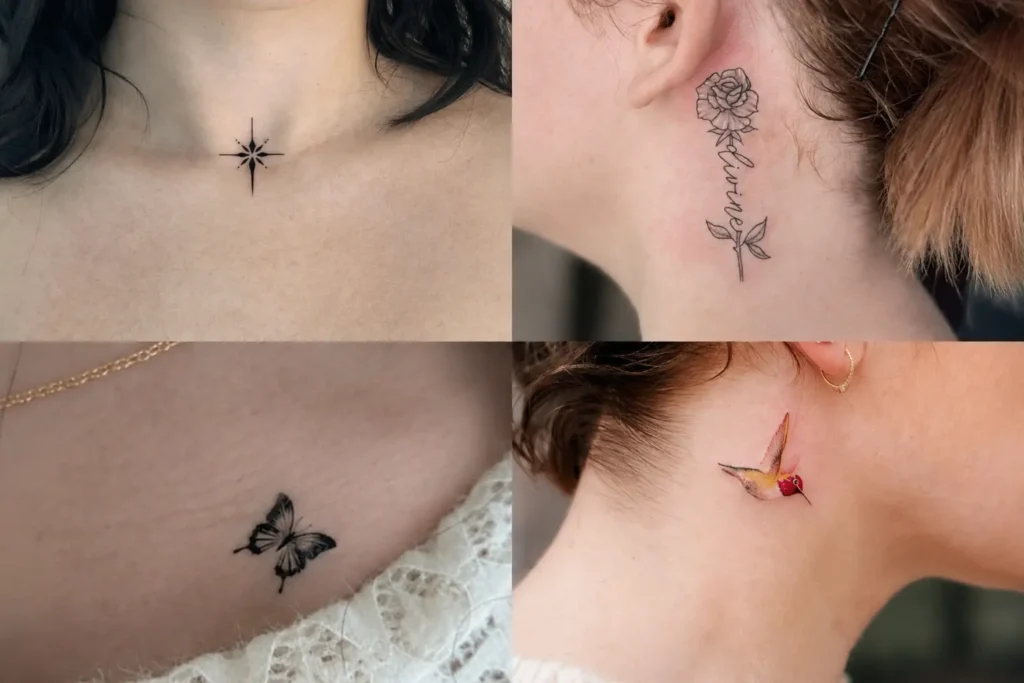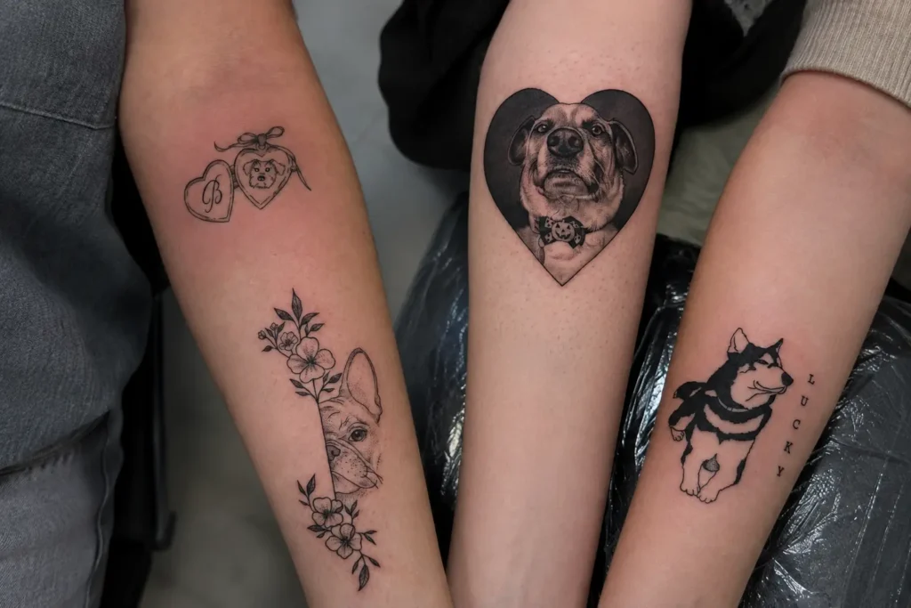
Nape offers a narrow canvas where proportion, spacing, and direction can shape the entire appearance of a tattoo. A Back Of Neck Tattoo can sit neatly along the centerline, spread horizontally toward the sides, or follow the natural curve beneath the hairline. Fine linework, ornamental geometry, wings, butterflies, birds, florals, gothic motifs, mandalas, and simple single-line concepts all interact differently with this compact area. Placement becomes especially important because excessive detail can crowd the skin, while thoughtful negative space can keep the artwork clear. Scale, symmetry, line weight, and the relationship between the tattoo and the neck’s natural shape all deserve attention before settling on a design.
1. Lace Diamond Nape
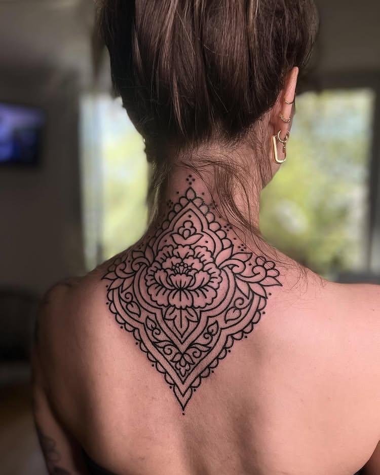
Lace Diamond Nape places a diamond-shaped motif directly at the nape, using fine internal lines to suggest the structure of lace without adding unrelated decoration. Symmetry keeps the central shape orderly, while small gaps between the lines prevent dense blackwork from overwhelming the narrow area. Careful tapering toward the lower point can make the composition follow the natural direction of the neck. Keeping the outer edge crisp gives the diamond a defined silhouette from a distance.
2. Wings Among Petals
Wings Among Petals combines wing forms with petals arranged around them, creating a layered composition rather than one isolated shape. Curved wing lines can frame the central area while the petals fill selected gaps without closing every pocket of negative space. Variation in line weight would help separate the wings from the surrounding floral forms. Placing the composition across the nape allows the wings to spread laterally while the petals soften the spaces between their edges.
3. Red Line Dragon
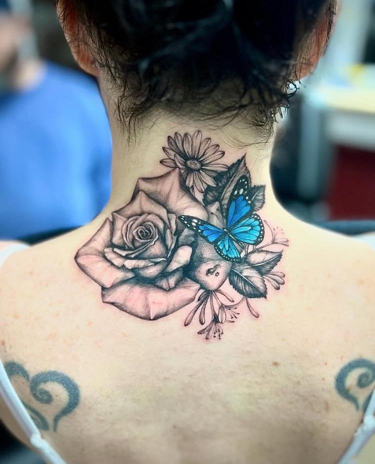
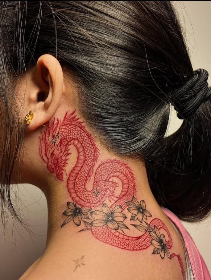
Red Line Dragon relies specifically on red linework to outline the dragon, making the color itself part of the visual identity. Flowing contours can follow the creature’s body so the figure feels continuous rather than assembled from disconnected sections. Keeping the interior relatively open allows the red lines to remain readable, especially on the small working area of the nape. Strong turns in the dragon’s silhouette can provide movement without requiring additional motifs or heavy shading.
4. Butterfly Constellation
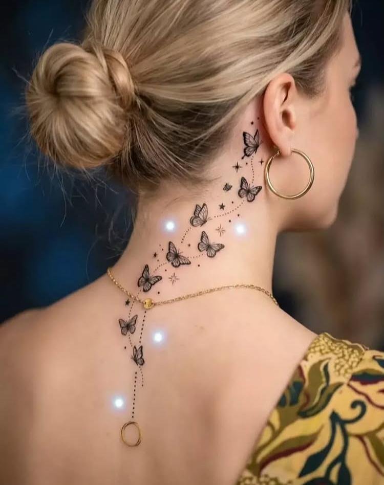
Butterfly Constellation stretches a sequence of butterfly forms across the composition, arranging them so their varying positions create a constellation-like path. Different sizes can establish a clear visual rhythm while preserving space around each wing. Fine connecting relationships should remain understated so the butterflies stay recognizable as individual focal points. A curved arrangement can also make the group feel as though it is traveling across the nape rather than sitting on one straight baseline.
5. Birds in Flight
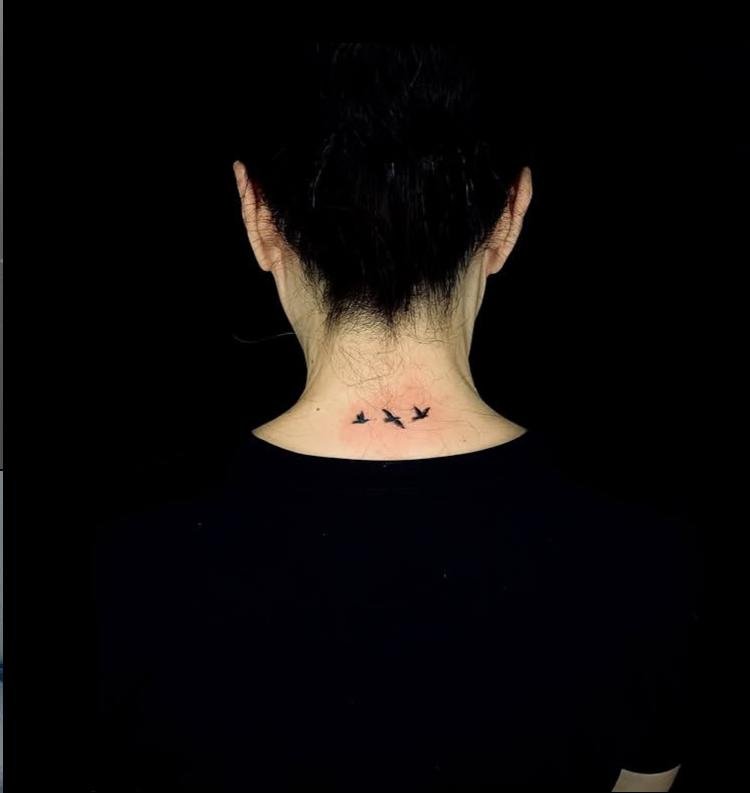
Birds in Flight uses multiple bird silhouettes to create movement through spacing and direction. Staggering their positions keeps the group from becoming a rigid row, while variations in wing position make each figure read separately. Open skin between the birds becomes an important part of the composition, especially around the narrow back-of-neck area. Consistent line weight can tie the separate silhouettes together without making the overall arrangement feel crowded.
6. Vintage Bloom
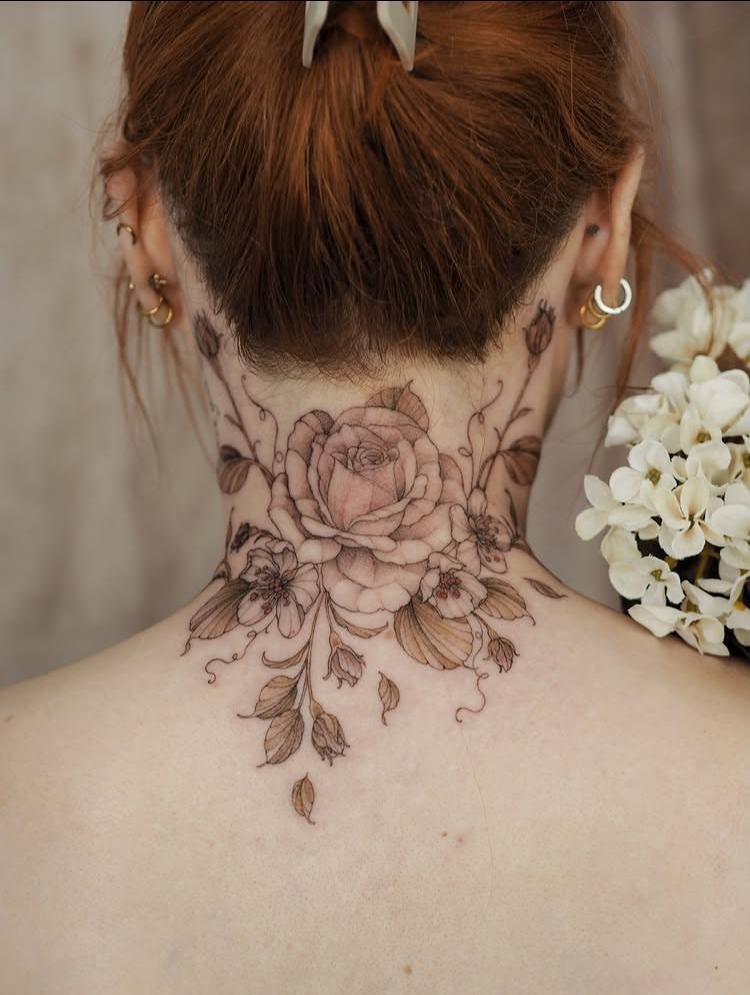
Vintage Bloom centers on a single flower treated with an older illustrative sensibility, where linework carries much of the visual character. Petal edges can receive carefully controlled contour lines, while selective shading adds depth toward the flower’s center. Keeping the outer silhouette clean prevents small details from disappearing as the tattoo ages. A balanced central arrangement suits the nape because the rounded bloom can occupy the available space without requiring a wide horizontal composition.
7. Blossom Trail
Blossom Trail creates movement by arranging blossoms along a continuous visual path rather than clustering them into one compact mass. Each flower can remain distinct, with spacing used to keep the trail light and readable. Curving the sequence gives the composition a directional quality and prevents the elements from appearing stacked mechanically. Smaller blossoms toward one end can also create a gradual shift in scale, giving the eye a clear route through the tattoo.
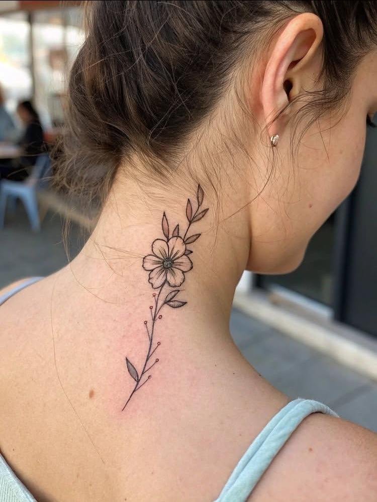
8. Butterfly Nape Moment
Butterfly Nape Moment focuses attention on a butterfly positioned specifically at the nape, allowing its wings to become the immediate focal point. Symmetrical wing placement can mirror the centerline of the neck, while open areas inside the wings keep the shape from becoming visually heavy. Fine interior marks can suggest wing texture without filling the entire silhouette. Leaving breathing room around the butterfly makes its central position more noticeable.
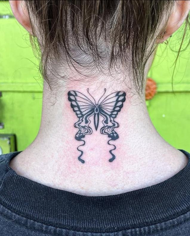
9. Quiet Flame
Quiet Flame reduces a flame motif to its essential outer shape, relying on controlled curves rather than a crowded interior. The pointed upper edges create a natural vertical direction, while the lower portion can remain compact and grounded. Negative space inside or around the flame helps preserve clarity when the tattoo is viewed from a distance. Restrained linework suits the concept because too much internal detail could compete with the simple flame silhouette.
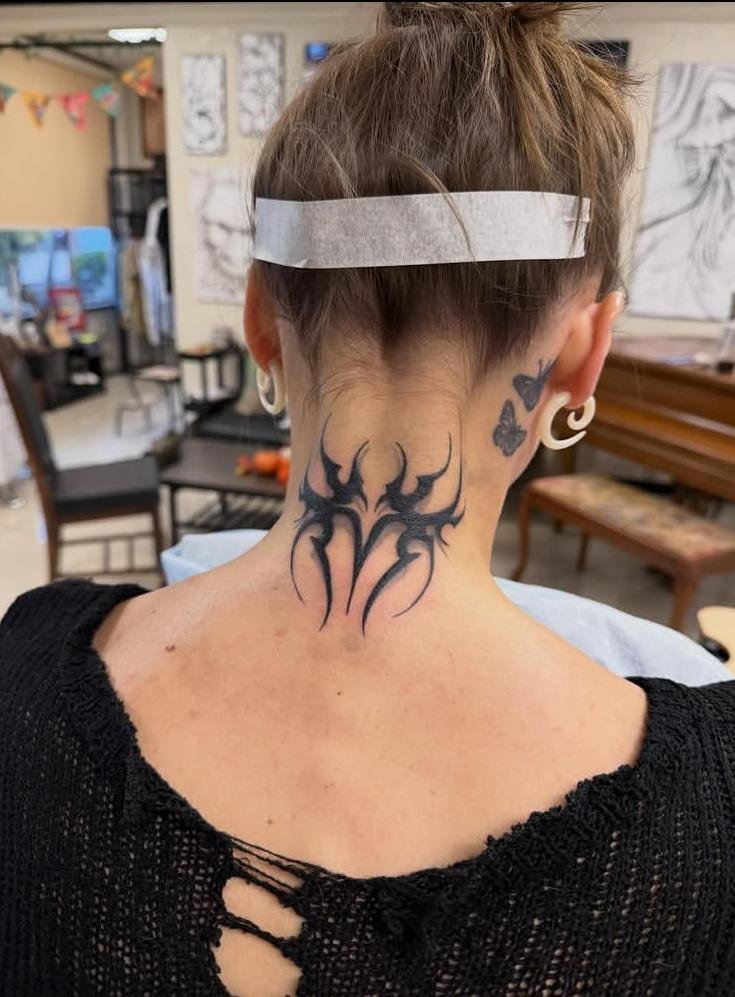
10. Wings, Centered
Wings, Centered places the pair directly along the neck’s centerline, making symmetry the defining feature of the composition. Matching contours on both sides create a balanced spread, while the inner edges can remain close enough to establish one unified focal area. Wing tips extending outward give the design horizontal reach without requiring extra elements. Careful spacing between feather lines keeps the wings readable instead of turning the interior into one dense block.
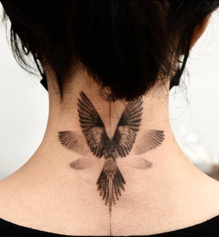
11. Gothic Ornament
Gothic Ornament uses structured ornamental forms to create a darker, architectural composition. Repeated curves and pointed shapes can build a strong central framework, with symmetry keeping the ornament visually stable on the nape. Fine interior details work best when separated by enough open skin to remain legible. Concentrating the heavier visual weight toward the center prevents the outer edges from becoming unnecessarily busy.
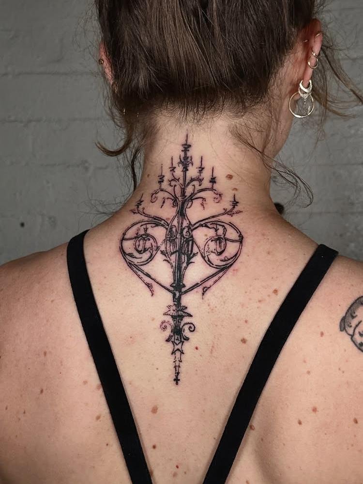
12. Magnolia Hush
Magnolia Hush centers the composition on a magnolia bloom, with broad petals providing most of the visual structure. Gentle overlapping lines can show which petals sit in front without requiring excessive shading. Keeping the flower’s contour open and readable allows the individual petals to retain their shape. A restrained arrangement works especially well here because the bloom itself supplies enough visual information without needing additional surrounding motifs.
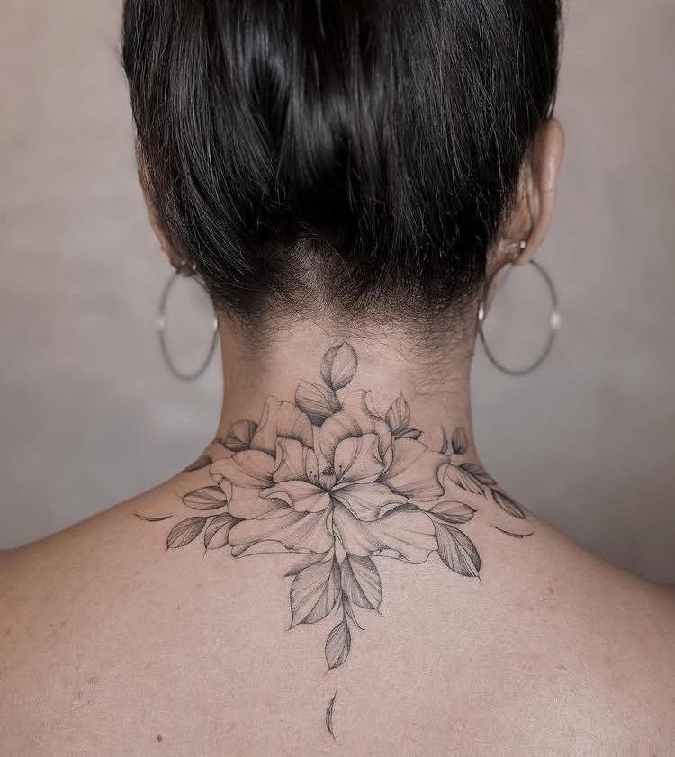
13. Butterfly, Center Stage
Butterfly, Center Stage makes one butterfly the sole visual focus, giving its silhouette room to carry the entire composition. Balanced wings create a strong central axis, while variations in interior linework can separate the wing sections without filling them completely. Positioning the body along the centerline gives the piece a naturally organized structure. Surrounding negative space becomes part of the tattoo’s presentation, helping the butterfly remain visually distinct.
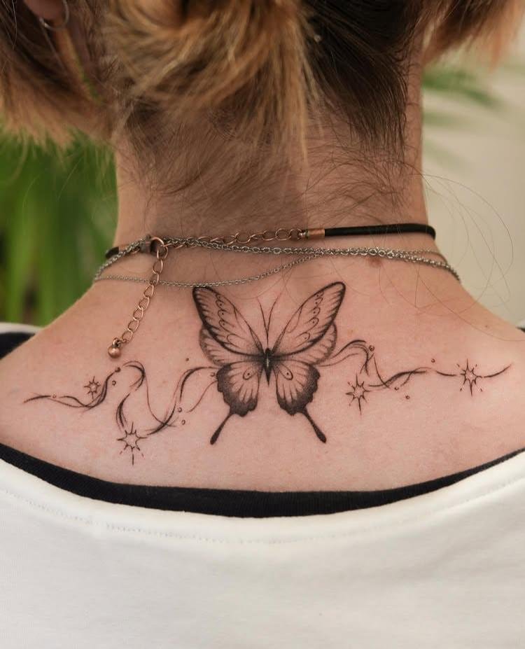
14. Baroque Symmetry
Baroque Symmetry builds its identity through mirrored ornamental shapes arranged around a central axis. Curving lines can expand outward before folding back toward the middle, creating the layered character associated with baroque ornament. Repetition needs careful spacing so the fine details do not merge into a dark patch. A clearly defined center gives the composition structure, while matching outer contours keep both sides visually balanced.
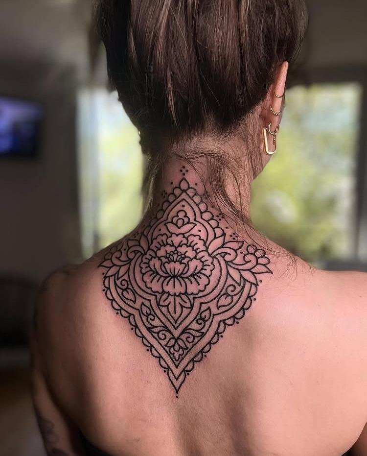
15. Just One Big Bloom
Just One Big Bloom gives a single flower enough scale to become the dominant feature instead of dividing attention among several smaller elements. Broad petals create a readable silhouette, while selective interior lines can establish overlapping layers. Concentrating detail toward the flower’s center adds depth without requiring a surrounding frame. Because the composition contains only one bloom, the negative space around its edges becomes especially important to keeping the tattoo from feeling cramped.
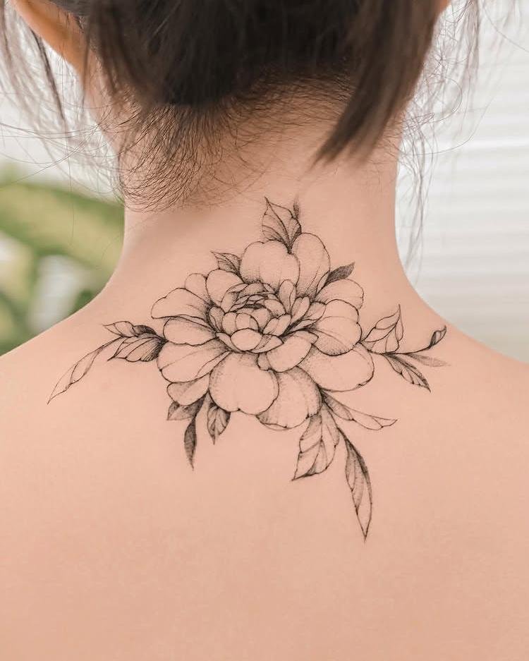
16. Peony in Bloom
Peony in Bloom captures the layered structure of a peony through overlapping petals that build outward from a dense center. Curved contour lines can distinguish the petal folds, while selective shading gives depth to the areas where layers meet. Maintaining variation between open and densely detailed sections keeps the flower readable. A strong central structure helps the peony hold its shape even as individual petal lines become finer toward the edges.
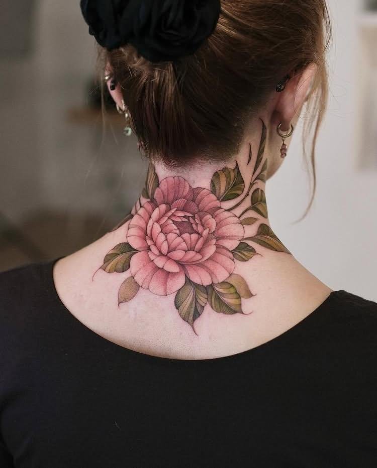
17. Abstract Wing Shape
Abstract Wing Shape interprets a wing through simplified curves and directional lines rather than a literal feather-by-feather rendering. Broad arcs can suggest the overall form, while interruptions in the linework create useful negative space. Asymmetry can make the composition feel more graphic, whereas mirrored contours would push it toward a more structured appearance. The key is keeping enough of the wing’s outer movement intact for the subject to remain recognizable.
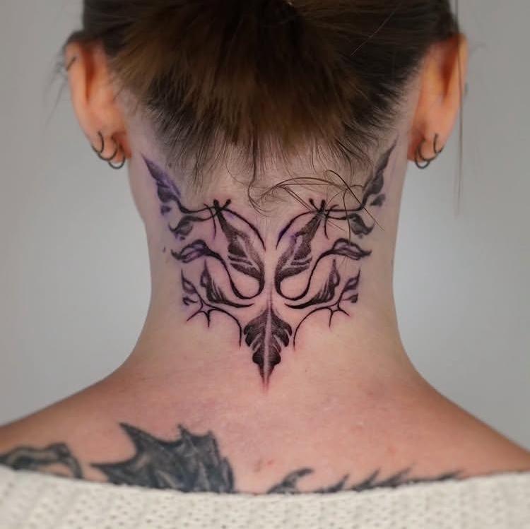
18. Rising Dove
Rising Dove depicts a dove moving upward, using the bird’s orientation to create a clear sense of lift. An angled body and raised wings can establish that direction without adding scenery or background symbols. Open space around the bird keeps its silhouette easy to read, particularly where the wings extend away from the body. Light contour work can preserve the bird’s shape while avoiding unnecessary detail in the narrow tattoo area.
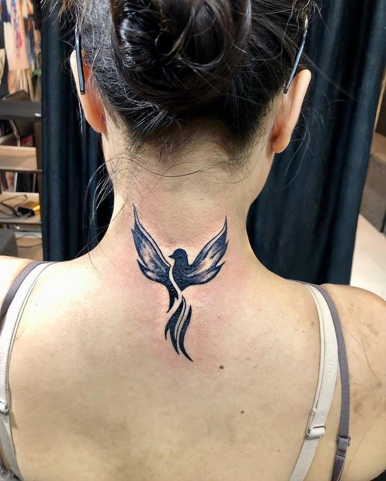
19. Angel Wings, Spaced Out
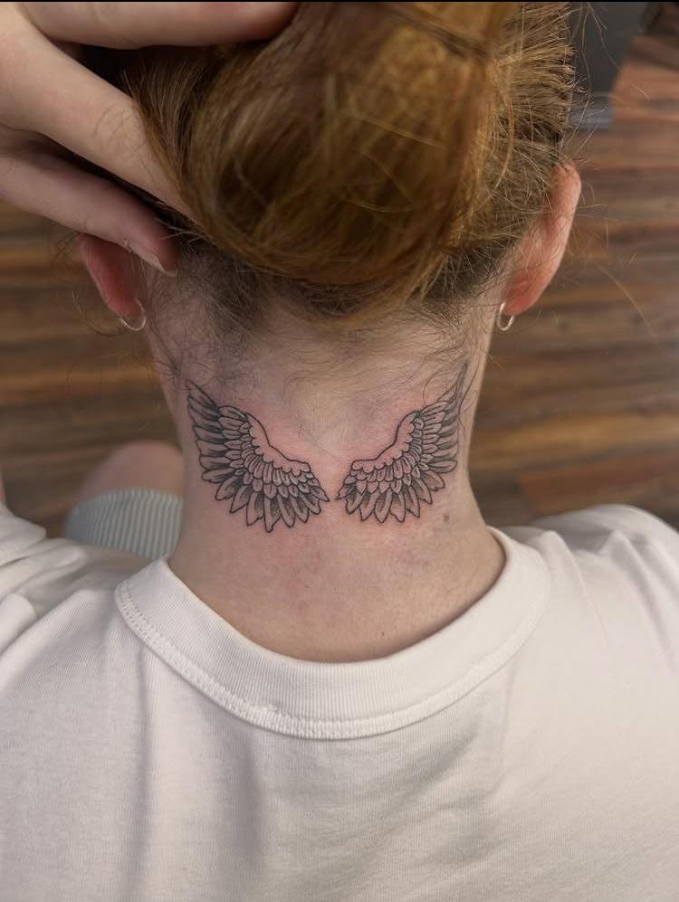
Angel Wings, Spaced Out separates the two wings instead of pressing them tightly together, making the gap between them an intentional part of the composition. Matching outer curves preserve balance while the central opening creates strong negative space. Feather rows can be arranged in graduated sections so the wings retain their shape without becoming solid masses. Wider spacing gives each side independent visual presence while still reading as one paired motif.
20. Quiet Company
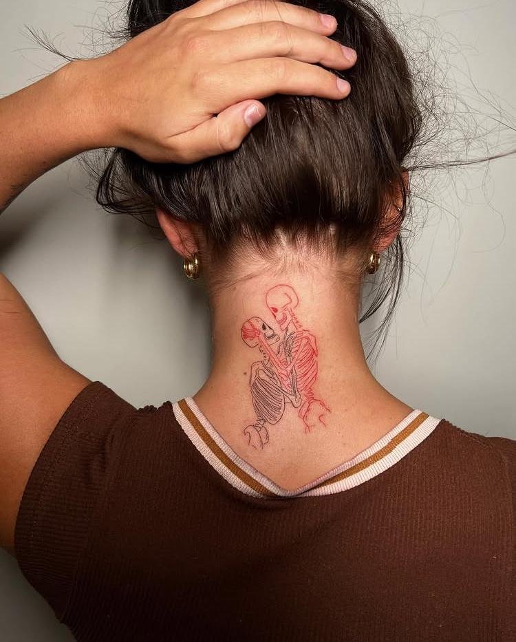
Quiet Company arranges multiple small figures or forms as a calm group, with spacing doing much of the compositional work. Rather than merging the elements into one dense cluster, deliberate gaps allow each shape to remain individually readable. Similar proportions can create cohesion while slight changes in position prevent a rigid arrangement. The restrained grouping works best when the surrounding skin remains open enough to preserve separation between the individual forms.
21. Full Nape Mandala
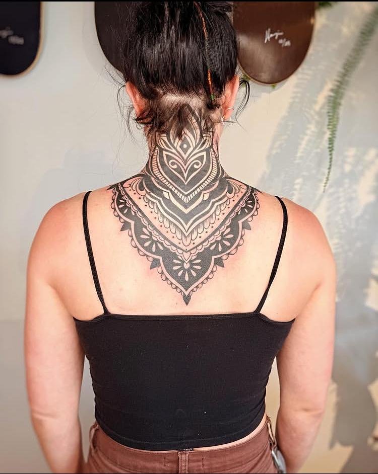
Full Nape Mandala uses the available nape area as a complete circular field, allowing repeated geometry to spread from the center toward the outer edge. Radial symmetry keeps each section aligned, while progressively smaller details can create layers within the circle. Dotwork or controlled shading may add depth to selected areas without covering every opening. Because the composition fills the nape, consistent spacing becomes essential to maintaining a clean overall structure.
22. Dark Gothic Wings
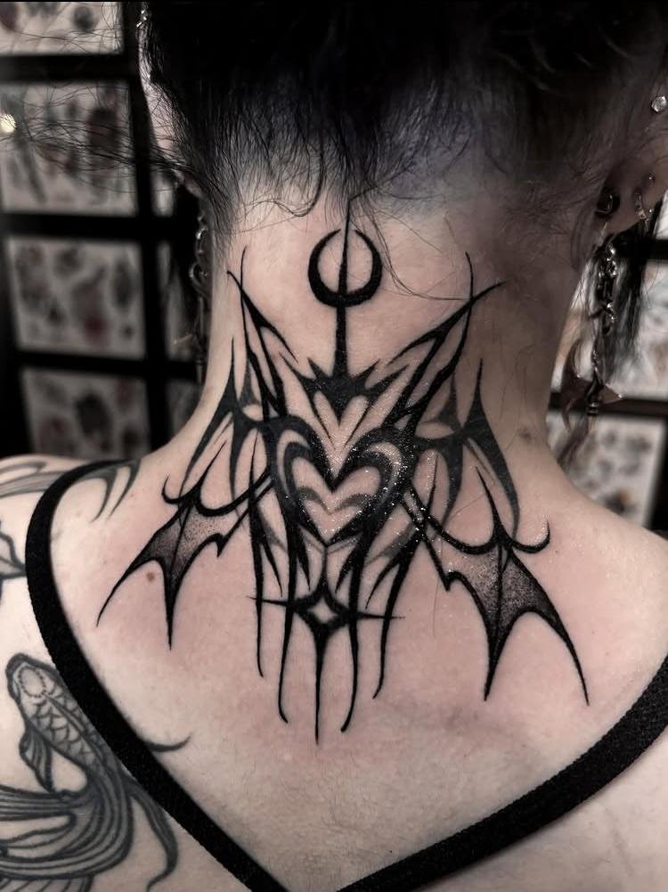
Dark Gothic Wings gives the wing motif heavier visual weight through dense blackwork, strong outlines, and concentrated shadow. Pointed feather shapes can create a sharper silhouette, while darker sections near the center anchor the composition. Leaving selected gaps between feather groups prevents the wings from becoming one uninterrupted mass. Broad outer contours help the design remain readable against the neck while preserving its distinctly gothic character.
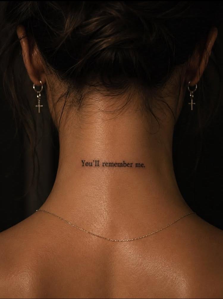
23. A Line Worth Remembering
A Line Worth Remembering centers the tattoo around one continuous line, making simplicity and direction the main visual features. The line can bend, rise, or loop according to the intended composition, but keeping its path uninterrupted gives the piece a clear identity. Changes in curvature create interest without requiring additional imagery. Negative space does most of the framing work, allowing the single line to remain visible rather than competing with other elements.
Conclusion
Back Of Neck Tattoo ideas benefit from careful attention to proportion because the nape offers a compact, naturally curved canvas. Strong concepts do not necessarily need many details; a well-controlled silhouette, thoughtful spacing, or clear centerline can carry an entire piece. Before choosing a reference, consider how the design’s width, density, and direction will sit against the neck rather than judging the artwork on a flat screen alone. That small shift in thinking can make the difference between a design that merely catches your eye and one that translates well to skin.