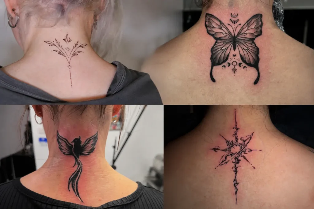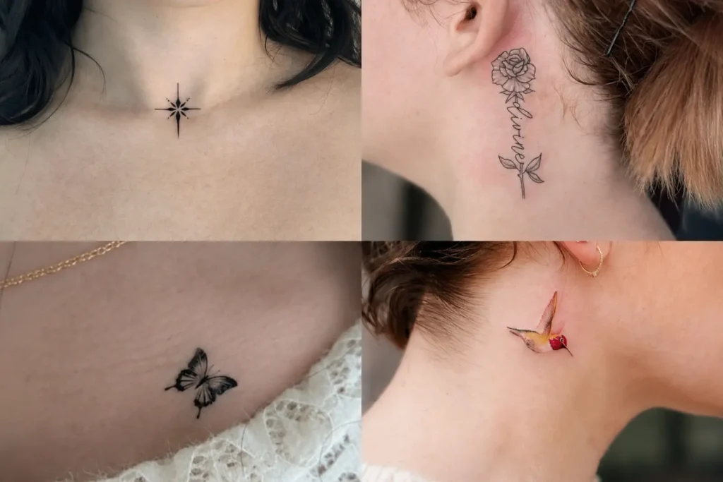
Losing a dog leaves behind countless small memories, from a familiar face at the door to the quiet routines that once shaped each day. A dog memorial tattoo can hold one of those memories in a form that feels personal without needing an elaborate composition. The ideas below explore different ways to capture a beloved dog through portraits, names, keepsake-inspired shapes, paw prints, lettering, and symbolic scenes. Some are understated and intimate, while others give the memory more visual presence. Paying attention to line quality, spacing, scale, and the strongest identifying detail can make a memorial piece feel connected to the dog it represents.
1. A Kiss Goodbye
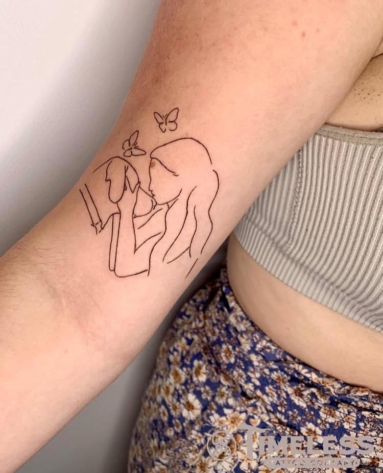
A Kiss Goodbye places the emotional focus on a simple farewell moment rather than a crowded composition. The strongest version can center the recognizable gesture in clean linework, allowing the interaction between the dog and the person to remain the visual focal point. Keeping surrounding space open gives that central moment room to breathe. Fine facial details should be selective, especially at smaller scales, so the tattoo remains readable as the lines settle over time.
2. Locket, Open
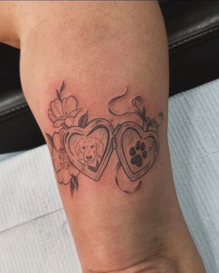
Locket, Open frames the memorial idea through the shape of an opened keepsake, giving the composition a clear visual boundary. One side can carry the central likeness while the other remains visually connected through the open structure. Rounded edges help the piece read immediately as a locket rather than a random frame. Careful spacing around the inner sections keeps small details from merging, particularly when the tattoo is reproduced at a compact scale.
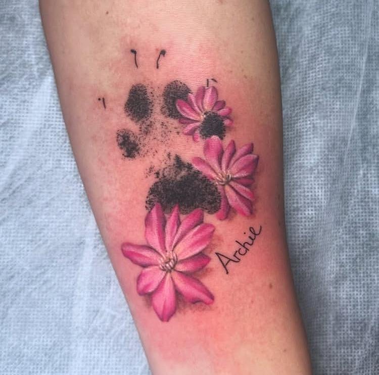
3. Archie in Pink
Archie in Pink makes pink the defining visual note, so the color should support rather than overwhelm the recognizable features of Archie. Pink can be concentrated in the areas where it has the strongest visual effect, while linework keeps the portrait readable. Facial proportions deserve particular attention because a few small changes can alter the likeness. Controlled color placement also prevents the piece from becoming visually flat or losing the character of the original subject.
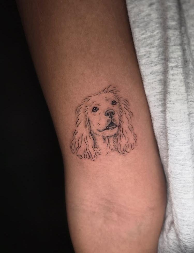
4. Soft Spaniel Sketch
Soft Spaniel Sketch works through loose, restrained drawing rather than heavy outlining or dense detail. Gentle line variation can suggest the Spaniel’s fur, ears, and facial structure without tracing every strand. Leaving portions of the sketch open creates the unfinished quality that gives the concept its name. Facial features should remain slightly more defined than surrounding fur, creating a natural focal point while keeping the overall drawing airy.
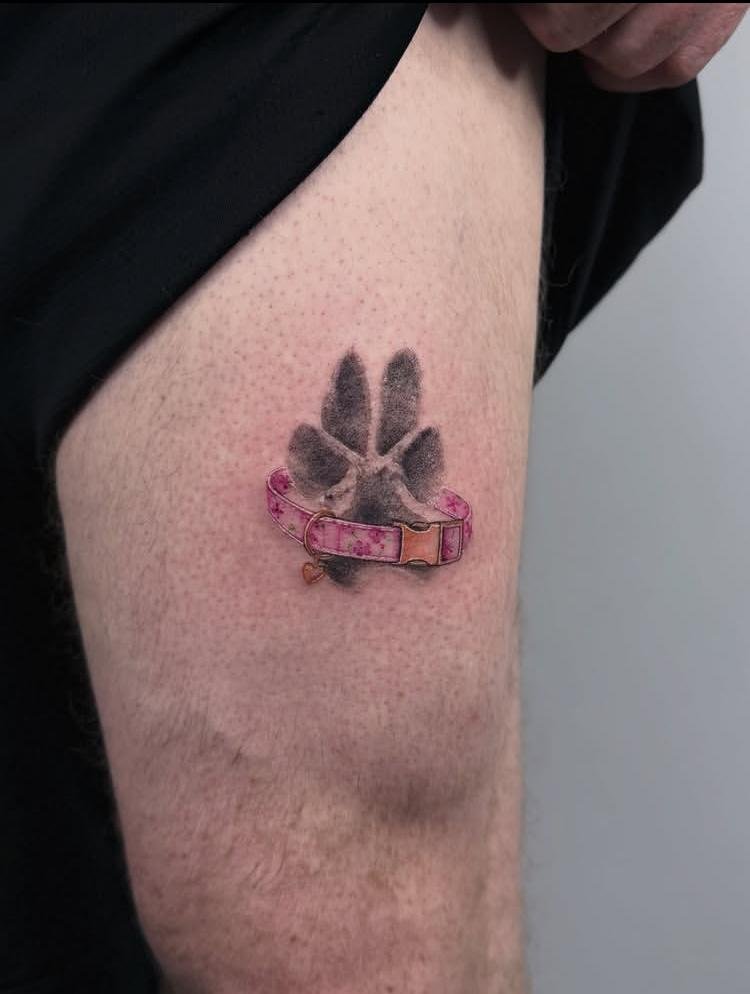
5. Pink Collar Print
Pink Collar Print centers the memory on the collar itself, with pink serving as the defining color cue. A clean representation of the collar can preserve recognizable shape and proportion without adding unrelated decoration. Rounded edges and restrained linework help distinguish the collar from surrounding skin. Keeping the composition compact also allows the pink element to carry the visual identity instead of competing with unnecessary details.
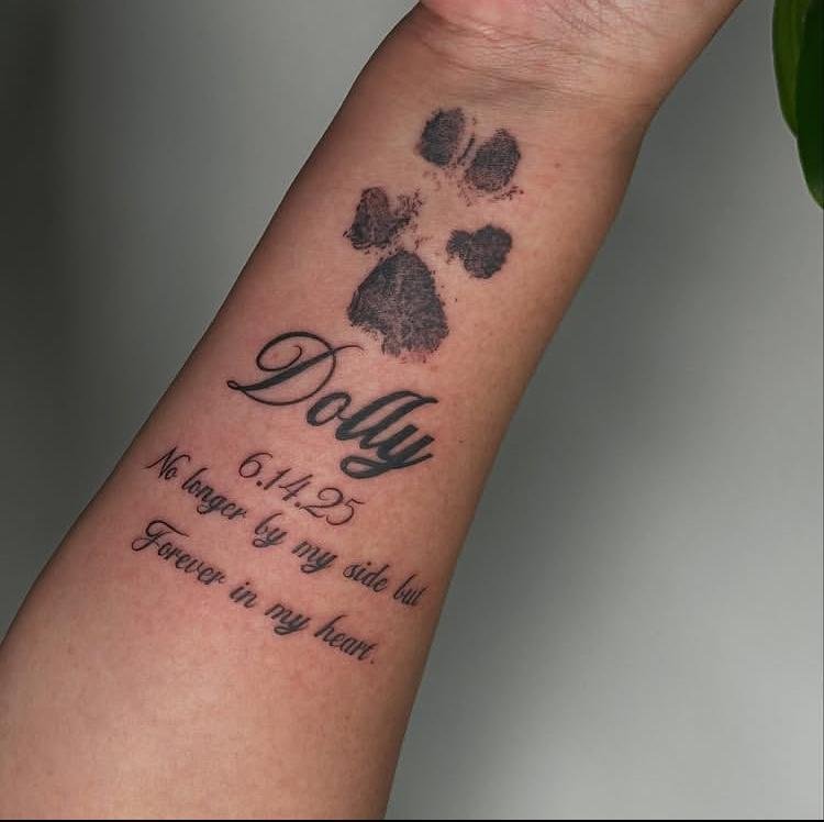
6. Forever, Dolly
Forever, Dolly relies on the name as the heart of the memorial, making lettering arrangement especially important. Script or handwritten lettering can follow a gentle flow, while the word “Forever” establishes the emotional connection without requiring additional imagery. Spacing between the two parts should remain generous enough for each word to stay legible. Small variations in letter height can give the phrase a naturally written character rather than making it feel mechanically typeset.
7. Two Best Friends
Two Best Friends depends on the relationship between two subjects, so positioning becomes more important than decorative detail. Their forms can sit close enough to read as a pair while retaining enough separation for each figure to remain recognizable. Matching proportions can create visual balance, whereas slight differences in pose may preserve individuality. Open space around the pair keeps the composition from becoming dense and allows the connection between the two subjects to remain central.
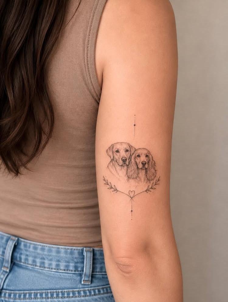
8. Framed in Memory
Framed in Memory uses a defined border to contain the memorial image, giving the piece a deliberate beginning and ending. The frame should have enough visual weight to support the interior subject without overpowering it. Clean edges create contrast with softer portrait details placed inside. Leaving a modest amount of breathing room between the image and border prevents the composition from appearing compressed, especially where fine facial or fur details need space to remain clear.
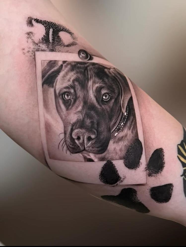
9. Flo, Every Lifetime
Flo, Every Lifetime gives the name “Flo” a prominent role, while the phrase “Every Lifetime” extends naturally from it as a continuous memorial statement. Letter spacing can distinguish the name from the supporting phrase without breaking their connection. A handwritten treatment can preserve a personal quality, particularly when the lettering follows a relaxed baseline. Keeping the words readable at the chosen scale matters more than adding decorative flourishes that could blur over time.
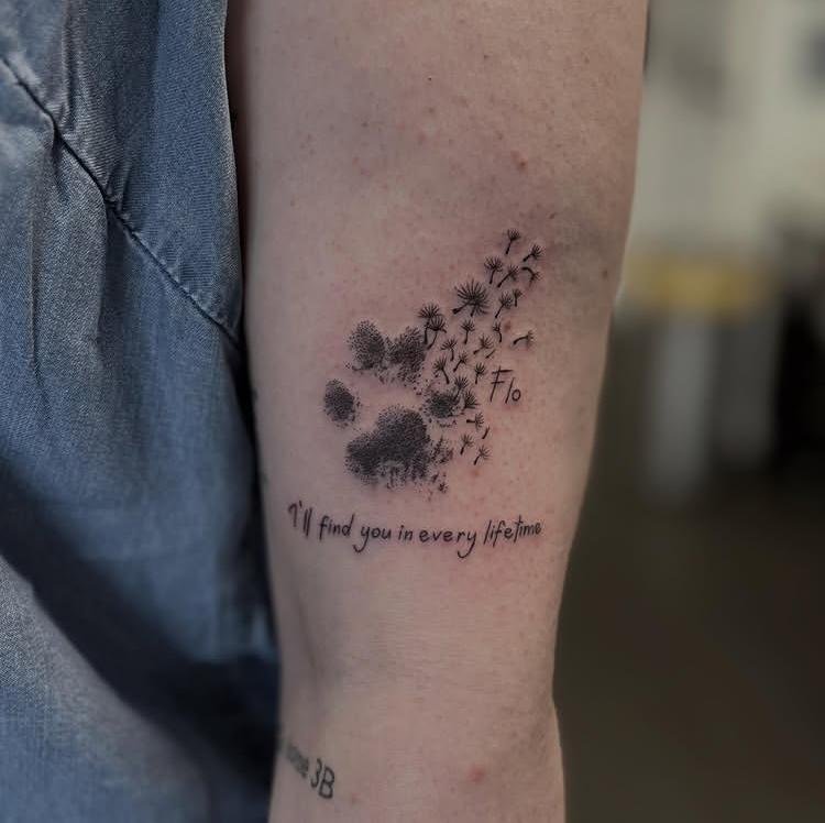
10. Till Next Time
Till Next Time works best as a restrained lettering piece where the phrase itself carries the entire concept. A flowing baseline can give the words gentle movement without requiring additional imagery. Different weights within the lettering can create a subtle focal point, especially around “Next Time.” Generous spacing between letters helps preserve clarity, while keeping the overall phrase compact gives it the feel of a personal inscription rather than a large typographic statement.
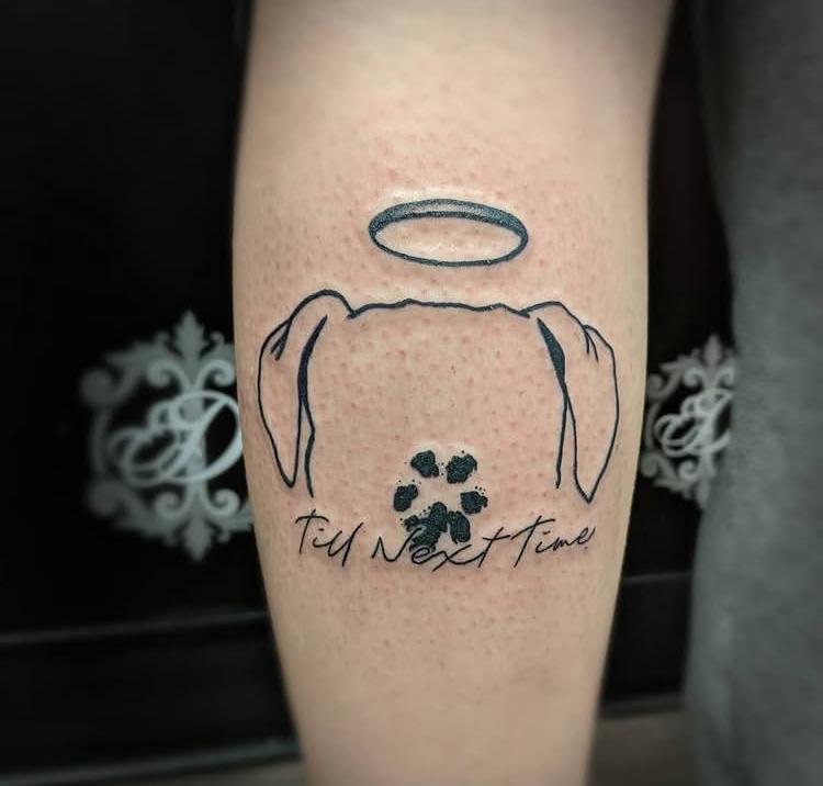
11. Luna’s Mark
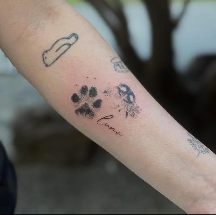
Luna’s Mark places Luna’s identity at the center, with the “mark” acting as the defining visual feature of the concept. The strongest execution keeps that identifying element clear and uncomplicated instead of surrounding it with unrelated motifs. Line thickness can vary slightly to separate the main mark from smaller supporting details. Maintaining a clean silhouette is particularly useful here because the tattoo needs to communicate Luna’s individual identity at a glance.
12. Growing Through Grief
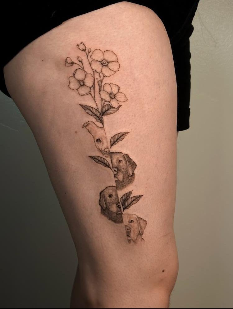
Growing Through Grief expresses its concept through a sense of upward development, so the composition benefits from directional movement. Elements should progress naturally rather than being scattered across the available space. Gradual changes in scale can make the design feel as though it is moving forward, while open areas keep the arrangement from becoming heavy. The phrase itself can be integrated carefully so the lettering supports the composition instead of interrupting its visual flow.
13. Golden Hour Portrait
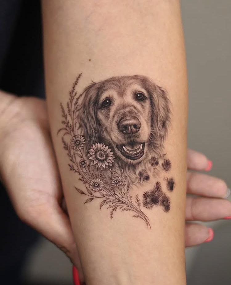
Golden Hour Portrait makes the portrait the primary subject while golden coloring provides the defining atmosphere. Warm golden tones can be reserved for selected areas rather than covering every feature, allowing facial structure and linework to remain visible. Shading around the face can create depth without obscuring recognizable characteristics. A controlled transition between inked details and open skin can also give the portrait a softer appearance without introducing extra imagery.
14. Husky Angel
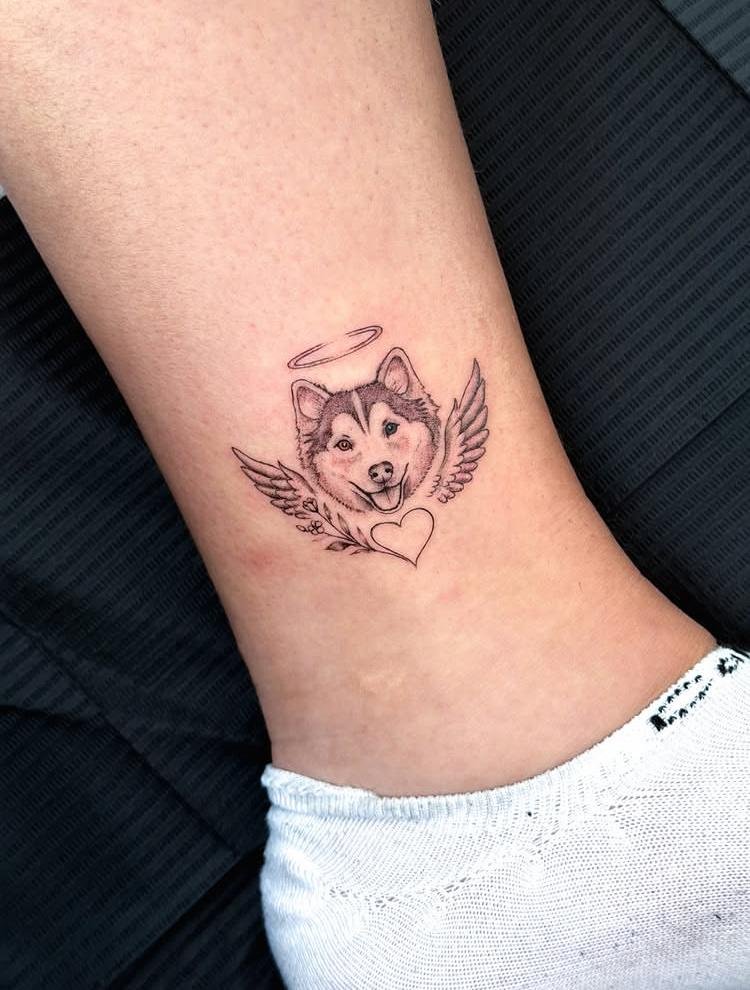
Husky Angel combines the recognizable structure of a Husky with an angelic identity, making the relationship between those two ideas central to the composition. The Husky’s ears, muzzle, and facial proportions should remain clearly defined so the breed does not disappear beneath the surrounding concept. Angelic elements need enough separation to read individually without crowding the face. Balanced placement can keep the head as the focal point while allowing the secondary feature to frame rather than obscure it.
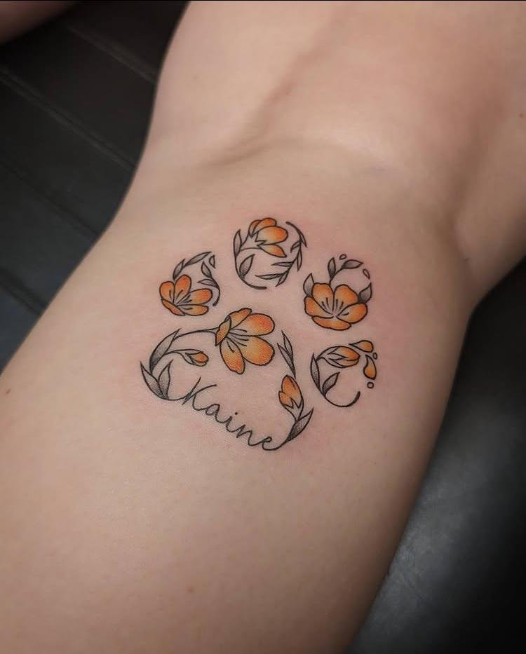
15. Kaine in Bloom
Kaine in Bloom connects Kaine’s identity with a blooming form, so the composition benefits from a clear relationship between the name and the growth element. Lettering can sit within or alongside the blooming structure, depending on how much visual space is available. Petal shapes should remain distinct rather than overlapping into an indistinguishable mass. Controlled line density around the center can create a focal point while the outer forms gradually open into more negative space.
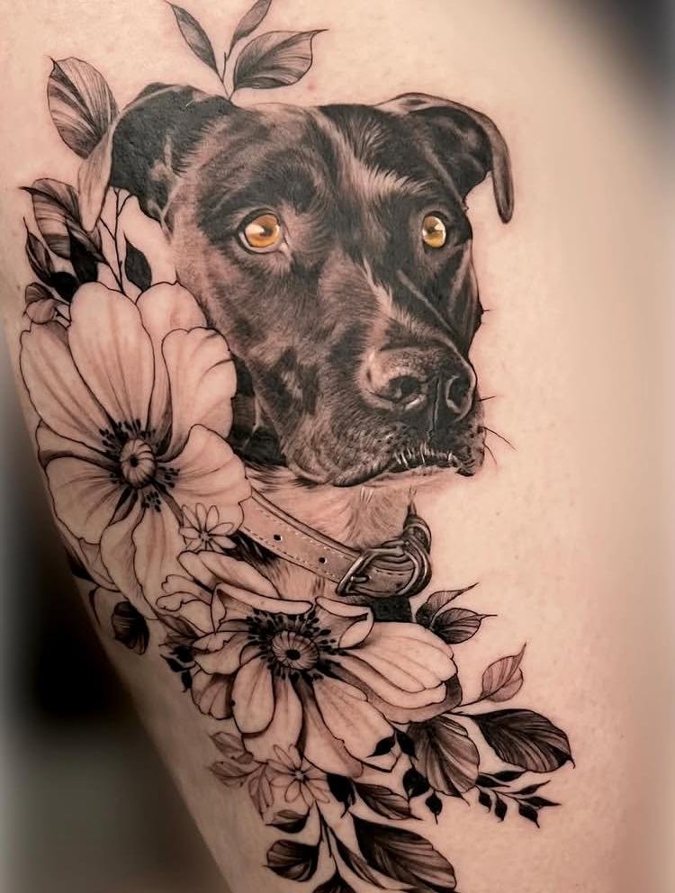
16. Amber Eyes
Amber Eyes makes the eyes the unmistakable focal point, so facial linework should remain secondary to their defining amber color. Small areas of color can create strong contrast without requiring the entire portrait to be colored. Careful placement of the irises preserves the expression and helps maintain the likeness of the dog. Surrounding features should use enough tonal definition to frame the eyes without competing with the specific detail that gives this concept its name.
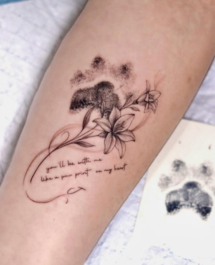
17. Paw Print Promise
Paw Print Promise combines the recognizable structure of a paw print with a written promise, creating two visual components that need clear separation. The paw should retain distinct pad shapes so it remains immediately identifiable even at a smaller scale. Lettering can follow a simple arrangement beneath or beside the print without becoming overly decorative. Leaving a small amount of open space between image and words keeps both elements readable and prevents them from visually merging.
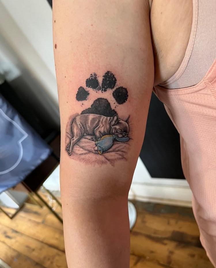
18. Sleeping Frenchie
Sleeping Frenchie depends heavily on pose, with the curled or resting posture carrying much of the character. A simplified outline can capture the compact body shape while selective facial details establish the Frenchie’s identity. Line thickness should remain consistent enough to preserve the relaxed silhouette without filling the composition with unnecessary shading. Open space around the resting figure reinforces the quiet posture and keeps the tattoo from feeling visually crowded.
19. Maggie’s Trail
Maggie’s Trail suggests movement through the arrangement of the trail itself, making direction the most important compositional feature. The path can curve gently rather than following a rigid line, giving the design a sense of continuation. Maggie’s name can be integrated without interrupting that route, provided the lettering has enough separation from the trail. Variation in spacing along the path can also prevent the composition from appearing like a perfectly uniform repeated pattern.
20. The Long Walk Home
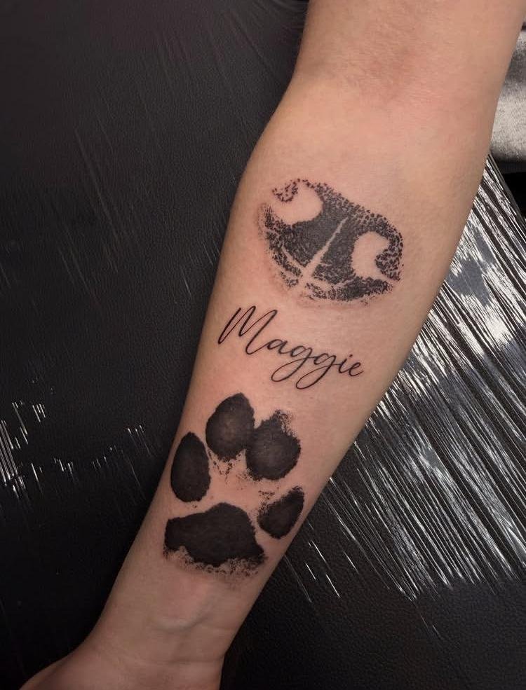
The Long Walk Home is strongest when the composition communicates distance through its arrangement rather than extra decorative elements. A directional line or path can guide the eye gradually through the tattoo, creating a beginning and an endpoint. Lettering can follow that movement or remain separate for easier reading. Open negative space becomes important because too many filled areas would flatten the sense of distance that gives this concept its visual character.
21. Field of Gold
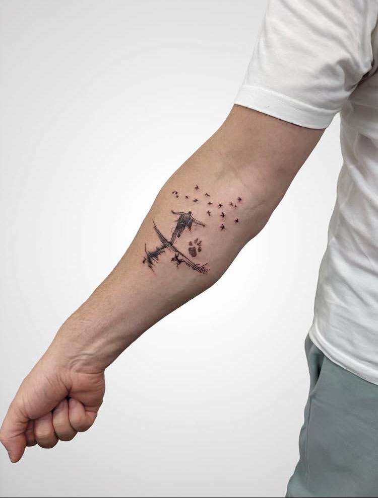
Field of Gold relies on golden coloring across a broad field-like composition, so the main challenge is controlling how much of the design receives color. Concentrated golden areas can create depth while leaving breaks between sections to preserve definition. Linework should establish the underlying structure before color is added, preventing the field from becoming a single flat block. Subtle shifts in density can also guide the eye through the composition without requiring additional motifs.
22. Still Around
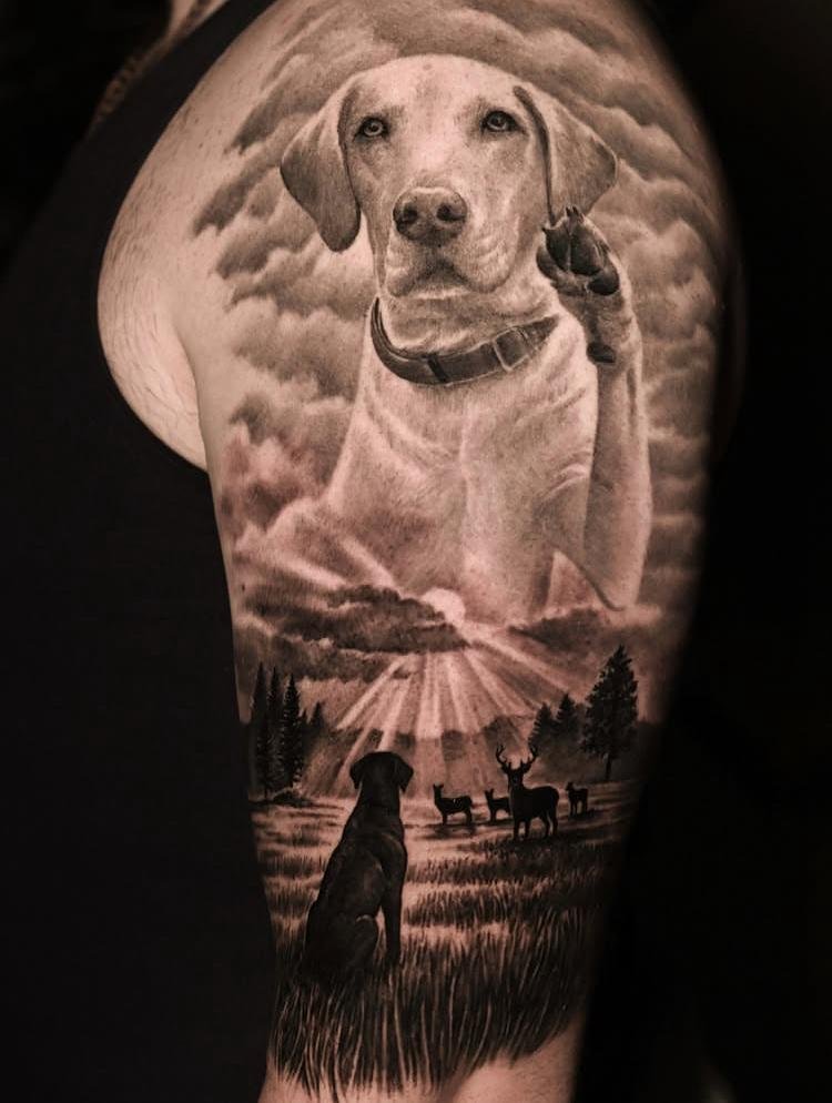
Still Around uses the phrase itself as the central visual element, making typography the main design consideration. Letterforms can remain clean and readable while slight variations in spacing give the wording a more personal quality. Keeping the composition visually open prevents the short phrase from feeling cramped. A restrained arrangement also allows the words to remain recognizable as the tattoo ages, which is especially important for small lettering.
23. Shaggy and Sweet
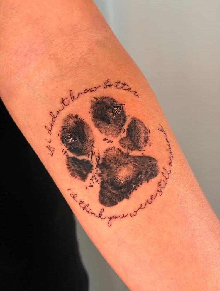
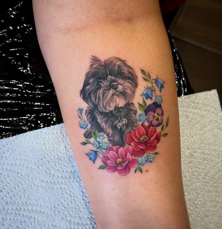
Shaggy and Sweet balances two recognizable qualities through the way the dog’s coat and expression are drawn. Fur texture can be suggested with grouped strokes rather than countless individual hairs, keeping the image readable. Facial features deserve cleaner definition so the softer character of the subject does not disappear into the shaggy texture. Variation between textured and open areas gives the composition depth without requiring heavy shading across the entire figure.
24. Charlie Forever
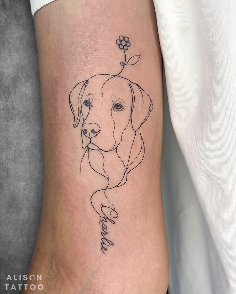
Charlie Forever puts the name and memorial phrase together, so the lettering needs a clear hierarchy. “Charlie” can carry the stronger visual weight while “Forever” follows as a supporting line or continuation. Consistent spacing keeps the two words connected without making them appear crowded. Hand-drawn irregularity can add personality, but the letterforms should remain distinct enough that neither word loses readability as the tattoo settles.
25. Split Portrait
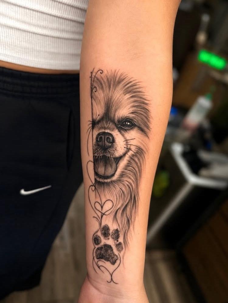
Split Portrait creates visual interest by dividing one portrait into separate sections rather than presenting the face as a single uninterrupted image. Each section needs enough recognizable structure to connect back to the same dog, especially around distinctive facial features. The separation can remain clean and intentional, using negative space as part of the composition. Matching the scale and alignment of both portions keeps the split from looking accidental while preserving the unusual structure of the concept.
Conclusion
A meaningful dog memorial tattoo does not need to reproduce every detail of a beloved pet to feel personal. Often, one recognizable feature, a familiar name, a meaningful phrase, or a carefully chosen portrait carries more weight than a crowded composition. Line quality, spacing, scale, and the amount of detail should all serve that central memory. Before settling on a final concept, compare how each idea communicates the dog’s identity visually. The strongest memorial piece is usually the one where the most important detail remains clear, personal, and recognizable even after the surrounding emotion has settled.